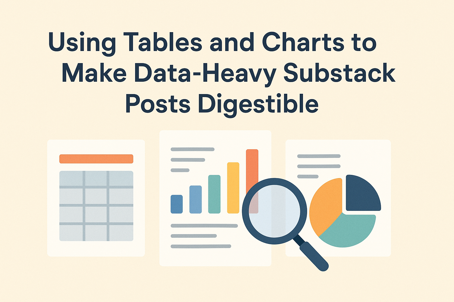
Creating data-heavy posts on Substack can be a challenge, especially if readers find the information overwhelming. Using tables and charts is an effective way to organize large amounts of data in a visually appealing and easy-to-read manner. Visual tools like tables and charts turn complex data into digestible bites, enhancing the reader’s comprehension and engagement.
By embedding Datawrapper charts in Substack posts, writers can present data dynamically without losing the audience’s interest. Tables can offer a clear view of statistics, making it easier for readers to compare numbers. Leveraging visual elements also adds a professional touch to the posts, encouraging readers to subscribe and return for future content.
A little creativity with chart and table presentation can transform a mundane post into something memorable. Different formats allow writers to choose what best suits their content—whether it’s a simple data table or an eye-catching chart. By doing so, they can create compelling stories backed by clear, concise data visualization.
The Role of Data Visualization
Data visualization plays a vital role in making complex information easier to understand and more engaging. It helps readers grasp intricate data patterns quickly, providing clarity and keeping them interested.
Enhancing Reader Engagement
Charts and tables draw the reader’s eye, breaking up dense text and adding visual appeal. They transform raw data into attractive visuals that are less overwhelming and more inviting. This boosts reader satisfaction, as visuals make content feel more approachable and interactive.
Using visuals also adds variety to the content, which keeps the reader’s attention. By providing a break from continuous text, visuals help maintain interest over longer posts. Furthermore, well-designed charts and tables can create a strong narrative thread, guiding the reader through the story that the data tells.
Facilitating Data Comprehension
Visuals simplify complex data sets, making it easier for readers to digest. They highlight key patterns, trends, and outliers, allowing for quicker insights. For instance, a pie chart can clearly show the proportion of different categories, making it an effective tool for comparing parts of a whole.
Tables provide a structured format to present data clearly, ideal for highlighting comparisons or specific figures across variables. These formats help readers interpret information at a glance, supporting faster comprehension and retention of details. This ease of access to information empowers readers to form conclusions without sifting through heavy data loads in the text.
Selecting the Right Types of Charts and Tables
Choosing the correct visual tools for data presentation can significantly enhance the readability and effectiveness of a Substack post. Different types of charts and tables serve various purposes, whether it’s for comparing data, showcasing trends over time, or displaying distribution.
Comparison Charts
Comparison charts are great for showing differences and similarities between various data points. These charts help when you want to contrast multiple items or categories side by side.
Bar charts are a common choice, making it easy to compare values quickly. They work well for qualitative data and when precise comparisons are needed. Column charts can also be used for comparison but in a vertical format. Each bar or column represents a single data point, allowing readers to grasp differences at a glance. Other types like radar charts can show several data sets simultaneously.
Using color or patterns can enhance a comparison chart. It’s important to keep the design simple to maintain focus on the data itself and avoid overwhelming the reader with too much detail or decoration.
Trend Charts
Trend charts are ideal for displaying data changes over time. Line charts are a popular option because they highlight upward or downward trends smoothly. They are useful in showing long-term data trends, helping readers see how something has evolved.
A good trend chart should have clear labels for time intervals, such as months or years, to help viewers follow the progression easily.
Simple area charts are also effective for emphasizing volume changes over time. They can depict how different segments contribute to a whole, like daily sales accumulating over a year. Including a few annotated points can guide readers to the most significant moments in the data.
Distribution Tables
Distribution tables are excellent for displaying a wide range of data points and how they are spread across certain categories. These tables work well for showing frequency and distribution of data points, helping to identify patterns or outliers.
Histograms often pair well with distribution tables because they visually support the detailed data shown in table format. Tables should be organized logically, and choosing a straightforward layout helps the reader focus on data relationships without unnecessary distraction.
Using simple headers and lined columns can improve readability. Consider bolding significant figures or coloring key categories to guide attention where needed. Distribution tables can sum up complex data succinctly, giving insights at a glance.
Composition Charts
Composition charts illustrate parts of a whole. Pie charts are the most recognized form, showing portions of data in percentages. They are ideal for simple compositions with a limited number of categories.
For more complex data, stacked bar or stacked column charts work better because they can show more detail. These charts allow each category to be broken down further, combining multiple data views in a single chart.
It’s crucial to maintain a balance in color and labeling with composition charts to avoid confusion. Graphics should remain clear and straightforward, enabling the reader to easily interpret how individual segments fit into the larger picture.
Designing Data Visualizations for Clarity
When making data easy to understand, it is crucial to design visualizations with a focus on simplicity and clarity. Using the right colors and fonts, breaking down complex data, and clear labeling are key strategies to achieve this goal.
Choosing Colors and Fonts
Colors and fonts play a vital role in enhancing the readability of data visualizations. Using contrasting colors can help highlight key data points, making them stand out. For instance, using shades of blue and orange can draw attention to specific trends. Colors must be consistent throughout to prevent confusion.
Choosing the right font is equally important. A simple, readable font makes it easier for readers to quickly grasp the information. Fonts like Arial or Helvetica are often recommended. Avoid overly decorative or fancy fonts that may distract from the data itself.
Additionally, color-blind friendly palettes ensure accessibility for a broader audience. Using bold text to emphasize important numbers or labels can help readers focus on the most important information without distraction.
Simplifying Complex Data
Simplifying complex data is about breaking it into understandable chunks. One effective way is to use data visualization techniques like charts, graphs, or tables. Bar charts can be used for comparing quantities, while line charts excel at showing trends over time.
Avoid cramming too much data into a single visualization. It is better to create multiple simpler visuals rather than a complex one that overwhelms. Keeping visuals straightforward helps the audience focus on core insights without unnecessary noise.
Storytelling through visualizations can also simplify data. Creating a visual narrative guides readers through the data in a logical way. A sequence of visuals can help convey information step-by-step, making complex datasets more digestible.
Labeling for Understanding
Labeling is crucial for making data understandable. Each axis or section of a chart needs clear, concise labels that tell the reader what they are looking at. Avoid jargon and use straightforward language. Labels should be easy to read and placed near the data they describe to minimize confusion.
Proper label placement increases the efficiency of a chart. When labels are aligned properly, it reduces the time needed for readers to comprehend the information. Use clear legends or keys for symbols and color codes. Well-labeled charts make it easy for readers to draw insights without having to refer back frequently.
Captions and annotations can provide additional context. They can help explain anomalies or significant points in the data, offering a clearer understanding of the visualization.
Best Practices for Data Narrative
Creating a compelling data narrative involves combining data, storytelling, and a logical presentation flow. Effectively communicating through data means choosing the right visuals and crafting a coherent story that speaks to the audience’s needs and interests.
Storytelling with Data
Storytelling with data means creating a narrative that is both engaging and informative. It’s about turning data points into a compelling story that captures the reader’s attention. The process starts with knowing your audience and tailoring the story to their interests. This may involve simplifying complex data points and highlighting the most relevant findings to make the data more relatable.
Choosing visuals that complement the narrative is key. This may involve using charts or graphs to emphasize critical points, ensuring they are clear and easy to understand. For example, the writer might decide to use a variety of charts to effectively convey different types of data.
Emotional connection is another important element. Stories often resonate more when they include human elements or real-life examples that the reader can connect with emotionally. In this way, storytelling with data becomes a powerful tool to connect facts with emotions.
Logical Data Flow
Logical data flow ensures that the story unfolds in a seamless way. It starts with an introduction to set the stage, followed by data presentation that logically progresses. This structure helps the audience follow the narrative without getting lost.
Using headers, bullet points, and breaks in text makes the content more digestible. It is crucial to maintain clarity and focus on key points. This technique not only aids comprehension but also keeps the reader engaged.
Charts and tables should be introduced with context, providing explanations for their relevance. For instance, when presenting data about audience preferences, using a specific visual format can clarify complex ideas. By ensuring the data flows smoothly, the narrative remains coherent and impactful.
Incorporating Tables and Charts Effectively
Tables and charts can make complex data easier to understand in Substack posts. They help by visually breaking down information and emphasizing key points.
Positioning within the Text
Positioning tables and charts strategically within the text is essential for maintaining a smooth reading flow. Ideally, visuals should be placed close to the related text to create an immediate connection. This helps readers better understand the information without needing to search for explanations.
Using labels and captions for tables and charts can enhance clarity. Labels add context, while captions provide brief explanations. This combination makes it easier for readers to grasp the purpose of each visual element.
It’s also helpful to incorporate visuals at logical breaks in the text. This could be at the end of a section or between paragraphs. Such positioning can offer visual relief from dense information, keeping readers engaged and informed.
Balancing Text and Visuals
When using tables and charts, balancing text and visuals is critical. Each visual should contribute meaningfully to the topic without overwhelming readers. It’s beneficial to ensure that visuals do not clutter the layout but instead enhance understanding.
For a balanced approach, it helps to limit the number of visuals presented at once. Introducing too many can cause confusion and detract from their intended purpose. Choosing the right type of chart or table for the data is vital. For instance, line graphs work well for trends over time, while bar charts are ideal for comparing quantities.
Color choices also matter, as they can highlight differences or connections between data points. Using clear and simple designs can prevent visuals from becoming distracting and instead aid in delivering a concise message.
Mastering the Tools and Software
To enhance data-heavy Substack posts, readers should learn about using tools and how they connect with the platform. They will benefit from understanding popular options and how to integrate them effectively.
Popular Data Visualization Tools
Several data visualization tools can transform raw data into engaging visuals. Tableau is widely favored because it offers powerful analytics and easy-to-understand visuals. It also handles large amounts of data effectively.
Microsoft Power BI is another great choice. It connects seamlessly with many data sources and offers interactive dashboards.
For those seeking free options, Google Charts is user-friendly and highly customizable. Chart.js provides simplicity and flexibility, especially for those who need basic charts. Each tool has unique features, so the choice depends on specific project needs and personal preferences.
Integrating with Substack
After choosing the right visualization tool, integrating it with Substack is the next step. Substack supports embedded visuals directly in posts, making it easy to include charts and tables.
Tools like Tableau and Power BI offer direct sharing options that can generate embed links. Users can then place these links into their Substack posts.
For Google Charts and Chart.js, users copy the HTML or script code. It’s important to preview posts to ensure the visuals appear correctly and enhance the reading experience.
Optimizing for Mobile Readers
Reading on mobile devices is different from desktops, so it’s essential to adjust content for smaller screens. One way to make information easier to consume is by breaking it into digestible chunks. Use bullet points or lists to highlight key ideas and make the text skimmable.
Responsive design is crucial. Tables and charts should adapt to different screen sizes without losing clarity. Designers can use responsive patterns to ensure data is readable whether readers are using phones or tablets.
Visuals should be clear and engaging. Choose the right chart types for the data being presented. It’s important that charts are not only visually appealing but also fit the mobile format without hiding key information. They need to be both user-friendly and informative.
Navigation is another key aspect. Make sure any interactive elements, like dropdowns or sortable columns, are easy to use on mobile. This can enhance the user’s experience by allowing them to interact with the data efficiently.
Consistency in formatting is important for readability. Use consistent styles for headers, fonts, and colors. This helps readers easily identify different sections and understand the relationship between data points, making the content more approachable on mobile devices.
Engaging Readers with Interactive Elements
Incorporating interactive elements into data-heavy Substack posts can significantly boost reader engagement. By allowing users to interact with data, they can explore insights on their own. This not only makes the content more engaging but also helps in understanding complex information.
Interactive charts are a great tool for this. Tools like Tableau or Plotly offer features that allow readers to drill down into specific data points. This approach lets users focus on areas they find most interesting or relevant.
Adding a searchable table can also transform a static data set into a dynamic experience. By making tables explorable with a search function, readers can filter results based on their queries, making it easier to find specific information. This can empower readers to navigate large sets of data effortlessly.
In addition to charts and tables, subtle interactive elements like tooltips can enhance understanding. These small pop-ups can provide extra information when users hover over data points, offering a fuller picture without overwhelming the layout.
Measuring the Impact of Your Visuals
Visuals are critical in making data-heavy content engaging. To know if visuals are effective, consider a few key metrics.
Engagement rate is one way to measure impact. This includes likes, comments, and shares on your post. If readers interact more with posts containing visuals, it’s a good sign they’re working.
Another measure is time spent on page. If readers stay longer, they might be absorbing the information better with visuals.
Click-through rates (CTR) can also reflect effectiveness. High CTR on linked visuals can indicate interest and relevance.
Regularly conducting A/B testing is beneficial. This involves creating two versions of a post: one with visuals and one without. Compare performance to see which engages better.
Qualitative feedback is valuable too. Ask readers for their thoughts on the visuals. Do they find them helpful or distracting? Their insights can provide guidance for future posts.
Besides, monitor the bounce rate. A lower bounce rate might suggest readers are intrigued by the visuals and explore more of the content.
Analyzing these metrics helps identify strengths and weaknesses in visual strategy. Adjustments can improve reader engagement and comprehension.