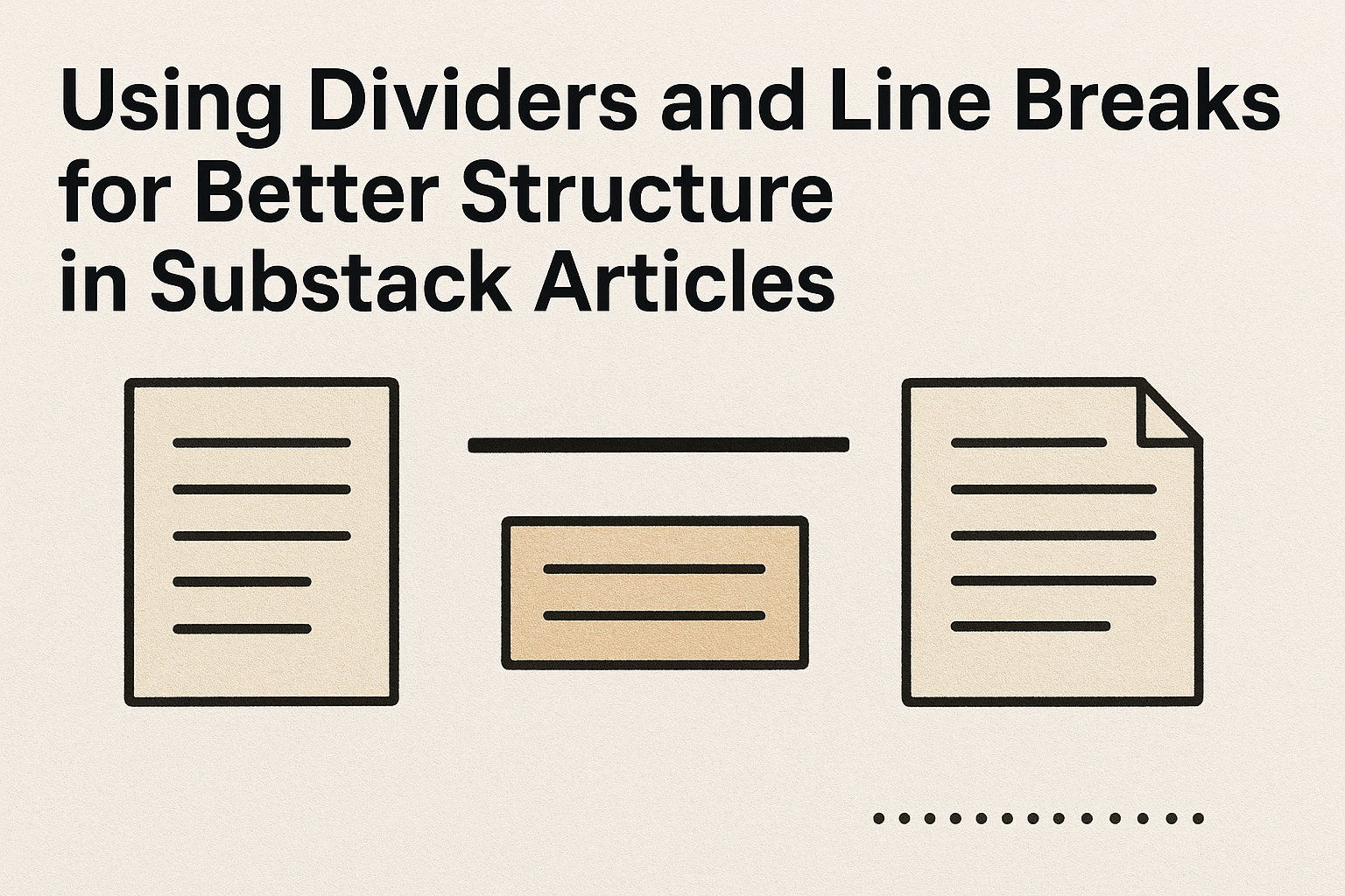
Crafting engaging Substack articles can seem daunting, but using simple tools like dividers and line breaks can make a big difference. These tools help organize the text, making it easier for readers to digest information. By strategically placing dividers and line breaks, writers can create a more inviting and readable structure.
Dividers act as visual cues, signaling to readers when one section ends, and another begins. This not only helps in organizing thoughts, but also keeps the audience engaged. Line breaks, on the other hand, offer breathing room between lines, improving readability significantly.
Many seasoned writers recommend a line spacing of at least 1.5 for better readability. When used correctly, these elements improve the flow and make the content more accessible to a wider audience.
Understanding the Role of Dividers
Dividers in Substack articles help organize content and guide the reader smoothly through the text. By creating clear separations, they enhance readability and improve the overall flow of an article.
Defining a Divider in Substack
In Substack, a divider is a horizontal line used to separate different parts of an article. This visual tool helps to break the text into sections, making it easier for readers to follow. A divider can be a simple line or more creative, depending on the author’s style.
Using dividers is straightforward. Writers can add them between paragraphs or around important points to draw attention. Dividers can also signal a shift in topic or introduce a new idea. This can be especially useful in longer pieces where clarity and organization are key. By placing dividers strategically, writers can make their content more engaging and accessible.
Benefits of Using Dividers
Using dividers offers several important benefits. First, they enhance readability by providing clear visual breaks in the text. Readers can quickly understand the structure and purpose of different sections.
Dividers also help maintain the reader’s attention. They serve as visual cues that a new topic or idea is coming, which can make the content more interesting. For writers, they offer a simple way to organize and highlight key points without over-complicating the design.
Moreover, dividers can improve the overall aesthetics of the article. By creating a clean and polished look, they make the content more appealing. This attention to detail can impact how readers perceive the quality and credibility of the publication.
Line Breaks 101
Line breaks are essential tools in writing. They help organize content, make articles more readable, and can emphasize key points. Understanding their proper use can greatly improve the flow and clarity of writing on platforms like Substack.
The Basics of Line Breaks
Line breaks are used to separate blocks of text. They can provide visual rest, making the content easier on the eyes. In digital writing, especially in platforms like Substack, they help in structuring the content.
When introducing dialogue or new thoughts, a line break can improve readability. It’s crucial not to overcrowd lines, as this can lead to a messy text block. Hence, authors are encouraged to use line breaks generously but wisely.
A balance is key. Line breaks should not be too frequent, or they can disrupt the flow. Instead, they should guide the reader through the content smoothly, offering pauses that enhance understanding and engagement.
Line Breaks vs. Paragraph Breaks
While both line breaks and paragraph breaks are used to separate text, they serve different purposes. A line break is typically just a single line space between text, often used for dramatic effect or to separate shorter pieces of content or dialogue.
In contrast, a paragraph break indicates a new section of thought or topic. It’s marked by a full blank line, signaling a more significant shift. For instance, line breaks might highlight a quote, whereas paragraph breaks often denote a transition in ideas or sections.
The distinction is important for maintaining clarity. Using them effectively can make writing not only easier to read, but also more compelling. Readers appreciate the logical organization that these breaks bring to text, helping to guide their journey through the article.
Incorporating Dividers into Your Articles
Dividers are a simple yet powerful tool to enhance the readability and structure of Substack articles. They help break up text into manageable sections and add visual interest to the page.
Strategic Placement of Dividers
Placing dividers strategically can guide the reader through the content smoothly. They work well between different sections to provide a clear break from one idea to the next. This helps the reader to focus better and digest information in chunks.
Dividers can also be used after an introduction or before a conclusion to signal a shift in the article’s flow. In longer pieces, they are useful in dividing the text into smaller, organized parts. This makes it easier for readers to navigate and find specific topics quickly.
Using dividers after lists or tables can further enhance organization. They create a clear distinction between the listed content and the following text. This makes the article look neat and professional. Writers should be careful not to overuse dividers, as too many can become distracting.
Design and Aesthetics of Dividers
Design choices for dividers can greatly affect the overall look and feel of an article. Substack’s editor allows for simple yet elegant divider styles, such as lines or symbols, which can match the article’s tone.
When choosing a divider design, it’s important to keep the audience in mind. For a professional look, simple lines are effective. More creative dividers, like patterns or symbols, can add a playful touch to personal blogs or creative writings.
The color of dividers should complement the article’s theme. Neutral colors like gray or black are classic choices, while bright colors can make a bold statement if used sparingly. Consistent use of a particular style adds to the cohesiveness of the publication.
Best Practices for Line Breaks
Line breaks can greatly improve the readability and clarity of Substack articles. Understanding when and where to use them effectively, while also being aware of common mistakes, can help writers engage their audience more effectively.
Effective Usage of Line Breaks
Clear Dialogue: Line breaks are essential when writing dialogue. Each new speaker should have their line, making it clear who is talking. This practice helps avoid confusion and keeps the conversation natural and easy to follow.
Enhancing Readability: Line breaks can help break up large blocks of text, making articles more approachable. Shorter paragraphs with line breaks encourage readers to keep going, reducing the feeling of being overwhelmed by dense content.
Section Dividers: Using line breaks to separate different sections or ideas can guide readers through the article’s flow. This division makes it easier to focus on each part without distraction.
Explore methods for effective line breaks in writing, including dialogue breaks and separating sections for clear understanding. Writers can utilize breaks to ensure their content remains engaging and well-structured.
Common Pitfalls to Avoid
Overuse: An excess of line breaks can disrupt reading flow. Instead of aiding clarity, they can create unnecessary pauses, making content feel disjointed. Writers should use breaks strategically and avoid placing them at every opportunity.
Inconsistent Style: Consistency is vital. Avoid mixing multiple line break styles, such as combining spaces, asterisks, and chapter breaks, within the same piece. Maintaining a uniform approach helps in maintaining a smooth reading experience.
Ignoring Context: Line breaks should align with the context and tone of the article. Be mindful of the overall structure and purpose when inserting breaks. For example, dramatic pauses in storytelling might require longer breaks compared to straightforward informational pieces.
These pitfalls highlight the importance of strategic planning in using line breaks. Avoiding them ensures that content remains clear and reader-friendly, maintaining a seamless flow throughout the article.
Enhancing Readability and Flow
Improving the structure of your Substack articles can make them more engaging and easier to follow. Using a clear narrative and guiding readers step-by-step enhances both readability and reader experience.
Creating a Narrative Structure
A well-organized narrative helps readers understand and follow the story with ease. Start by outlining the main points you want to cover. This outline acts as a roadmap, keeping the main ideas in order.
Break down complex ideas into smaller parts, using clear and concise language. Think of each paragraph as a single idea, making transitions between them smooth and logical.
Including short anecdotes or examples can make the content relatable and engaging. Lists and bullet points are also great tools for highlighting key information without overwhelming readers. This storytelling approach clarifies the message while keeping the reader’s interest.
Guiding the Reader’s Journey
Effective use of headings and subheadings provides a clear path for readers. These elements act like signposts, guiding them through the article. Readers can easily find the information they are interested in without getting lost.
Incorporating images, charts, or tables can break up large blocks of text and make the content visually appealing. For example, a relevant image or a table can summarize data quickly and clearly.
Using links within the article to connect related topics is another useful technique. This keeps readers on the page longer by offering them additional, relevant information without needing to search elsewhere. Such strategies ensure a smooth and enjoyable reading experience.
Technical Insights
Using dividers and line breaks can greatly enhance the readability and structure of a Substack article. Dividers help break up content into clear sections, while line breaks ensure text is well spaced and easy to follow.
How to Insert Dividers in Substack Editor
In the Substack editor, inserting dividers is a simple task that can make articles more organized. To add a divider, users can click the “+” button found in the editor toolbar. From the menu, selecting “Divider” will place a line where the cursor is located. This line serves as a visual break, guiding readers through the text.
It’s particularly helpful for separating different topics or thoughts. If authors want to change the placement of a divider, they can drag and drop it using the handle that appears when hovering over the divider. Adjusting these dividers as part of the editing process can enhance the flow of the text.
Creating clear sections with dividers not only improves aesthetics but also aids readers in comprehending the article. Keeping articles tidy and easy to navigate ensures a better user experience.
Customizing Divider Styles
While Substack offers a straightforward divider tool, customization can add a personal touch. Although the standard divider is a simple horizontal line, authors might want to change its appearance to align with their unique style. Customizing styles can be done through HTML and CSS for those familiar with coding.
For users without coding skills, using consistent formatting like bold or italic text near dividers can create emphasis. By combining these styles, writers ensure that their dividers enhance the visual interest of articles.
Experimenting with subtle style changes can differentiate an article visually, making it more appealing. Consider the audience’s preferences in presentation, making sure the choices are clear and not distracting from the content.
Advanced Techniques
Advanced techniques focus on enhancing the readability and engagement of Substack articles. These methods include the use of interactive dividers and ensuring these elements are mobile-responsive, which are important for keeping content accessible and visually appealing across different devices.
Interactive Dividers
Interactive dividers can be a great way to engage readers. By incorporating clickable or expandable elements, writers can create a dynamic reading experience. This can involve using dividers that reveal hidden content when clicked, acting as interactive elements that break up the text in an engaging way.
For instance, a clickable section title can unfold additional information, keeping articles concise on the surface while still packing in plenty of detail. Animated dividers can visually cue readers to pay special attention to transitions in the content, emphasizing major points or shifts in discussion.
Such features not only enhance the overall look and feel, but also encourage readers to interact with the material, making the engagement more memorable. This can be particularly effective for complex articles where maintaining reader interest is crucial.
Mobile Responsiveness of Dividers
Ensuring the mobile responsiveness of dividers is crucial, as many readers view content on their phones. Dividers should adjust seamlessly to different screen sizes without losing their design or functionality. This means that whether viewed on a large desktop monitor or a small smartphone screen, the dividers should maintain the structure and fluidity of the text.
Responsive design might involve elements like fluid widths and scalable graphics that ensure the dividers blend well with the rest of the content. Testing dividers on different devices and using responsive web design principles can improve the overall user experience.
By prioritizing mobile responsiveness, authors can make sure their content reaches the widest possible audience without losing quality.