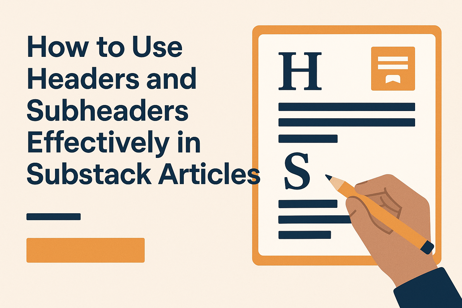
Using headers and subheaders effectively can make your Substack articles more engaging and easy to read. These elements help organize content and guide readers through the main points of your post. By making your headers informative, you provide clarity and draw attention to key topics.
Headers are not just for decoration; they support readability and flow. They serve as a road map, allowing readers to skim and find sections that interest them. Engaging and clear headers can increase your chances of attracting and retaining subscribers as they create a more satisfying reading experience.
When writing on Substack, using varied header formats, like H2s and H3s, helps break up text and highlight important sections. Tailoring your headlines to reflect the essence of your writing can also encourage new subscriptions by making it easy for readers to grasp the content’s value. Check out this guide on customizing Substack banners and headers to enhance your publication’s visual appeal further.
Understanding the Structure of Substack Articles
In a Substack article, structure plays a key role in guiding the reader. Effective use of headers and subheaders improves clarity and engagement.
The Role of Hierarchy in Readability
When organizing content, hierarchy is essential. It helps readers follow the flow of the article by breaking it down into manageable parts. Headers guide the reader through main ideas, while subheaders dive into more detail. This layered approach makes the text easier to navigate and understand. A well-structured article keeps readers engaged and reduces confusion. Visual breaks like headers allow readers to scan quickly and find the information they need. Using hierarchy effectively means choosing headings that accurately reflect the content below.
Headers vs. Subheaders: Knowing the Difference
Headers and subheaders serve different functions. A header introduces a major section, outlining the primary topic. Subheaders, on the other hand, provide more detail, discussing specific points related to the main theme. Knowing when to use each ensures content is well-organized. Headers draw attention and set the stage for key ideas. Subheaders add depth, helping readers grasp detailed arguments or explanations. In platforms like Substack, clear differentiation between headers and subheaders enhances readability and keeps readers interested. It’s beneficial to use bold or italics for emphasis, making sections stand out. Understanding these differences will make writing more effective and reader-friendly.
Crafting Impactful H2 Headers
H2 headers play a crucial role in keeping readers engaged and providing structure to an article. They serve to convey the main message, maintain a consistent style, and effectively incorporate keywords.
Conveying the Core Message
Crafting a strong H2 header starts with clearly conveying the core message of the section it introduces. Readers should immediately understand what the upcoming content is about, helping them navigate through the article with ease. This clarity not only guides readers but also enhances their overall reading experience. Each H2 should summarize the section’s main idea in a few words, acting as a mini-summary that tells the reader what’s to come.
An impactful H2 header acts as a beacon, drawing attention to important information without being vague or misleading. It sets the tone for the content that follows, ensuring that readers aren’t left guessing. This is particularly important for articles offering detailed insights or instructions, where clarity can significantly enhance comprehension and engagement.
Maintaining Consistency in Style
Keeping a consistent style for H2 headings throughout an article builds a cohesive reading experience. This includes uniform use of font, size, and color, as highlighted in the principles for effective headings. Consistency not only makes an article aesthetically pleasing but also reinforces its structure, making it easier for readers to follow along.
Beyond visual elements, maintaining a consistent tone and phrasing for each H2 is also crucial. Whether an article is casual, formal, or somewhere in between, H2 headers should reflect this style consistently. This uniformity helps establish rhythm and familiarity, allowing readers to focus on the content itself without being distracted by stylistic discrepancies.
Using Keywords Strategically
Incorporating keywords into H2 headers aids both reader comprehension and search engine optimization (SEO). Strategic placement of relevant keywords in H2 headers can help readers quickly grasp the main points of a section, making skimming easier. It also improves the article’s visibility in search engine results, attracting more readers to the content.
Care should be taken not to overload H2 headers with keywords, as this can disrupt clarity and readability. Instead, integrate keywords naturally, ensuring they fit well within the context of the header. This balance between keyword usage and readability helps maintain the header’s primary function: guiding the reader through the article effectively.
Designing Engaging H3 Subheaders
Creating effective H3 subheaders in your Substack articles can greatly enhance readability and flow. These subheaders make the content easier to scan and help readers understand the context.
Enhancing Scannability
Readers often skim articles before deciding what to focus on. Using H3 subheaders can help guide their eyes through the content. These subheaders should be clear and concise, summarizing the section’s main idea.
Bullet points or numbered lists underneath H3 subheaders can further improve scannability. A consistent style, like bold or italic text, also helps these subheaders stand out.
Visual breaks between blocks of text make articles more inviting. This approach keeps the layout clean and organized.
Providing Context for Sections
An H3 subheader gives a preview of what’s to come, helping set expectations. When writing, it’s important that each subheader conveys the essence of the section it introduces.
Including keywords in subheaders can improve search engine optimization. This makes your articles easier to find online.
In addition, context-rich subheaders help maintain the reader’s interest by clarifying the relevance of the content. They serve as signposts, guiding readers through the narrative and ensuring they stay engaged with the topic.
Balancing Content Density and White Space
In Substack articles, good spacing can make your content more appealing and help readers concentrate better. Headers and subheaders organize ideas and create visual breaks, ensuring a pleasant reading experience.
Aesthetics of Spacing
Creating an attractive layout involves balancing text and white space. White space, or the empty space between text and images, enhances readability and prevents the page from looking cluttered. When a page is too dense with text, readers may find it overwhelming.
To achieve balance, writers should break up large paragraphs into smaller chunks. Lists, bullet points, and tables can add variety. Adjusting line spacing and using consistent margins also contributes to a clean look. Well-organized content with thoughtfully placed white space invites readers to engage more deeply.
Improving Reader Focus
Strategic use of white space helps guide the reader’s eye, making it easier to navigate content. Consistent headers and subheaders aid in quickly identifying key sections. These elements act like signposts, directing attention and helping readers absorb information efficiently.
Short paragraphs improve scanning, especially for readers skimming for specific information. White space creates pauses, letting readers rest their eyes and concentrate better on what follows. Text that is too densely packed can cause fatigue, reducing engagement. Thus, balancing content density and white space not only enhances visual appeal but also supports better focus and understanding for readers.
Incorporating Visual Elements
Visual elements can enhance the appeal and engagement of a Substack article. Effective use of images and alignment with text improves reader experience and retention.
Using Images and Graphics
Images and graphics can transform a plain article into an engaging one. They help convey complex ideas quickly and break up large blocks of text, making content more digestible. Using high-quality, relevant images ensures clarity and adds value.
Branded graphics or infographics that match the article’s message can further engage readers. It’s important to balance imagery with content to avoid overwhelming the reader. Selecting images that fit the tone and topic of the article enhances the narrative. Creators should regularly update visuals to keep content fresh and engaging.
Alignment with Textual Content
Aligning visuals with text is crucial for clear and logical flow. Proper alignment involves positioning images where they relate to the content directly. This helps maintain the reader’s focus.
One effective technique is wrapping text around images, making sure it doesn’t disrupt reading. Consistency in font, style, and color between text and images provides a polished look. Properly captioned images can offer additional context, enhancing the reader’s understanding. Testing different alignments can reveal what best suits the article’s design and readability.
Optimizing for Reader Engagement
Creating engaging content in Substack involves using interactive elements and encouraging reader interaction. These strategies keep the audience invested and foster a sense of community.
Interactive Elements
Incorporating interactive elements such as polls, quizzes, or discussion prompts can significantly boost engagement. These features invite readers to actively participate in the content, making them feel more connected. For example, the Chat feature in the Substack iOS app allows real-time interaction by enabling quick updates and image replies. This keeps readers interested and involved.
It’s also effective to use bold and italic text to highlight key points. This draws the reader’s eye and emphasizes important information, catering to the F-shaped reading pattern. Using these techniques helps readers absorb the main message more easily and keeps them coming back for more.
Encouraging Comments and Shares
Comments and shares are essential for building a vibrant community on Substack. Encouraging readers to comment on posts invites feedback and creates conversation threads that keep discussions ongoing. This not only helps writers understand their audience better but also makes readers feel valued.
To promote sharing, writers can remind subscribers to share posts with friends or include social media share buttons prominently. A call-to-action at the end of posts, inviting readers to share their thoughts or the content, can further boost interaction. By using these strategies, writers can enhance their relationship with readers and foster a loyal community.
Adapting Headers for Mobile Readers
Adapting headers for mobile readers involves ensuring that the text is easy to read without losing the essence of the message. It’s essential to prioritize readability and responsive design to engage mobile users effectively.
Responsive Design Considerations
Responsive design ensures that headers look good and function well on any device. When creating a layout for mobile readers, consider using flexible grids and layouts. This approach allows headers to adjust according to the screen size automatically.
Another important factor is the font size. Larger fonts help readability on smaller screens, making sure users don’t need to zoom in to read clearly. Headers should be designed so that they don’t break awkwardly when viewed on different devices. Using fluid typography, where the font size scales with the size of the viewport, can help maintain readability.
Testing the layout on various devices ensures that the headers look consistent. Tools for responsive design testing can simulate how the text appears across different screen resolutions. This will help identify any adjustments needed to enhance the user experience.
Shorter Headers on Small Screens
Mobile screens are smaller, so keeping headers concise is crucial. Shorter headers are easier to read and can capture a reader’s attention faster. The goal is to convey the main message without crowding the space.
Using keywords in headers can be helpful, as they highlight the article’s main points quickly. Bullet points or lists can organize content efficiently, making it more digestible for users on the go.
Line breaks should be used wisely to prevent awkward text wrapping. Ensuring that text doesn’t spill into unintended lines enhances readability. Limiting the word count for mobile headers can keep them tidy, clear, and direct, improving overall engagement with the article.
SEO Best Practices for Headers
Headers are essential for structuring content and improving SEO. Using keywords and keeping the hierarchy clear boosts a webpage’s visibility and readability.
Incorporating Relevant Keywords
Using keywords in headers helps search engines understand the content. When someone searches for information, keywords in headers can improve how the page ranks. Picking the right keywords involves researching terms that readers are likely to use.
It’s important to include these keywords naturally within the headers. For example, if writing about a recipe, using “delicious chocolate cake recipe” in an H1 tag can be effective. Headers should sound natural and fit the content flow.
Also, avoid keyword stuffing. Using too many keywords can feel forced and might even hurt rankings. A balanced approach is more beneficial for both SEO and the reader’s experience.
Header Tags and Search Rankings
Header tags, ranging from H1 to H6, help create a clear structure. Each level represents its significance, with H1 being the most important and typically used for the main title. For instance, an H1 tag might highlight the overall topic, while H2 and H3 tags break down subtopics.
Using separate tags for main topics and subtopics guides both readers and search engines. This way, a page seems more organized and logical. Not skipping levels is crucial—moving from H1 to H3 directly can confuse readers and search engines.
Properly used header tags improve chances of ranking higher on search results. They ensure content is user-friendly and aligns with SEO best practices.