Formatting Substack articles for curated weekly recaps can be a game-changer for writers looking to engage their audience effectively. By using helpful tools like headings and clear structure, writers can keep readers interested throughout the newsletter. A well-organized format is key to making content easy to digest and appealing to subscribers.
When setting up a weekly recap, it’s useful to use sections like an article summary, a roundup of interesting links, or a “in case you missed it” section. This kind of structure not only keeps information organized but also ensures that there’s something for everyone in the audience. Readers are more likely to stay engaged when they know what to expect.
An additional aspect of Substack formatting that benefits writers is monetization. Writers can charge a subscription fee for their content, which Substack helps manage by handling payments and distribution. This makes it easier to focus on crafting quality content while potentially earning a stable income.
Understanding Substack’s Layout Options
Substack offers a variety of layout options to help writers create visually appealing and engaging newsletters. These layouts are user-friendly and make it easy to design content that stands out.
Writers can choose from several editorial styles. These styles provide a professional look to their publications. Selecting the right style can make a publication more attractive to readers.
The platform also includes a feed of posts layout. This layout is similar to a traditional blog format, displaying posts in a long list down the page. It gives readers easy access to multiple articles at once.
With Substack’s Site Design feature, users can preview changes before publishing. This ensures that any adjustments to layouts or styles meet their expectations.
Using these layout options can bring visual consistency and a unique style to each publication.
Tables and lists can help break down complex information into manageable bits. Writers can use bullets or number lists to organize content, making it clearer and more structured.
Substack allows easy formatting of articles by including headers, bold or italic text, and other features to emphasize key points. This flexibility helps writers focus on delivering the best possible reading experience for their audience.
Experimenting with different formats or combining them can enhance the overall style and appeal of a weekly recap. It’s important to find a layout that aligns with the writer’s voice and the needs of the audience.
Essential Components of Curated Weekly Recaps
Curated weekly recaps are a great way to engage readers by summarizing the most important happenings of the week. They combine key article highlights, visual elements, and insightful commentary to provide a clear and engaging reader experience.
Highlighting Key Articles
Highlighting key articles helps readers quickly catch up on what’s important. It’s essential to choose articles that have had significant impact or interest during the week. These can include trending topics, in-depth analyses, or stories with unique perspectives.
A summary for each article is beneficial. Keep summaries short, focusing on the main points. Providing these summaries helps readers decide which articles to delve deeper into. Adding links to original articles can also be valuable, allowing readers to explore more if they choose.
Incorporating Visual Elements
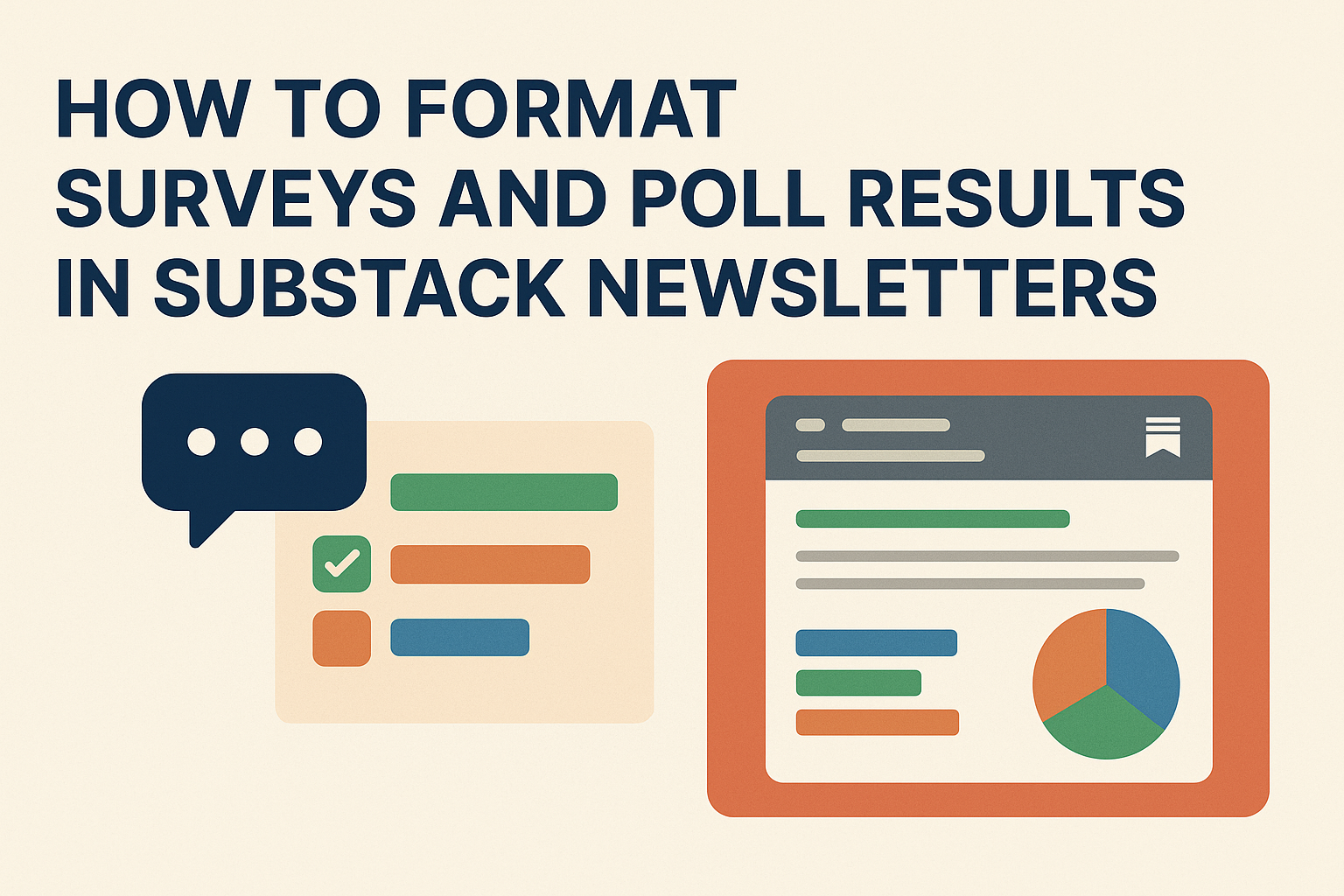
Visual elements play a crucial role in keeping recaps engaging. Use images, graphs, or charts to illustrate key points. Visuals can help break down complex information, making it easier to understand.
For instance, a bar chart can effectively display statistical data from an article. Infographics also work well for summarizing processes or trends. It’s important to ensure that visuals are high-quality and relevant to the content being covered.
Consistent design throughout gives the recap a polished look. This includes using the same font style, colors, and image sizes across the entire recap.
Adding Contextual Commentary
Contextual commentary adds depth to the recaps by providing analysis or insights. This can be done by explaining why certain articles were chosen and their relevance to ongoing themes or discussions. Commentary also guides readers in understanding broader connections between featured articles.
Including quotes from experts or other publications can enhance the commentary. It provides different viewpoints and enriches the reader’s experience. The tone used in commentary should be friendly and informative, encouraging readers to think critically about the topics presented.
Engagement can be further boosted by asking readers for their thoughts on certain topics, inviting them to join the conversation and share their perspectives.
Formatting Tips for Clarity and Engagement
To create a well-structured Substack article, use headers, bullet points, and quotes effectively. These elements help readers navigate the text and absorb key points easily.
Utilizing Headers and Subheaders
Headers and subheaders guide readers through the article. They break up sections, making the content easier to navigate and understand. Proper use of headers helps highlight main ideas and categorize details efficiently.
Subheaders within sections can signal a shift in focus or provide additional context. They give readers a roadmap of the topics covered, enhancing the reading flow. Each header should be clear and concise, reflecting the content of the section it introduces.
Headers also improve SEO by signaling content hierarchy to search engines. By structuring information this way, writers can increase reader engagement and ensure their articles are both accessible and visually appealing.
Implementing Bullet Points and Lists
Bullet points and lists are perfect for presenting information clearly and efficiently. They break down complex ideas into digestible pieces, making it easier for readers to follow along.
Lists can be used to highlight important items or steps in a process. For instance, summarizing tips or key takeaways is more impactful when formatted this way. It’s important to keep lists consistent, using parallel structure to maintain clarity.
Using bullet points can also help readers who skim articles to quickly find the information they need. They provide a visual break, drawing attention to significant content without overwhelming the reader with long paragraphs.
Breaking Text with Quotes or Highlights
Inserting quotes or highlighted text between paragraphs adds emphasis and breaks up chunks of text. This technique can underscore a crucial point or introduce a different perspective.
Quotes bring a personal touch or authoritative insight to an article. It’s essential to choose quotes that are relevant and enhance the main argument. If a certain phrase or sentence captures the essence of the article, it can also be set apart by using a different font or style.
Highlights can be used sparingly to draw attention to key ideas. They help readers remember important information and keep them engaged as they move through the article.
Optimizing the Reading Experience
Making your Substack articles easy to read can engage your audience better. Paying attention to paragraph spacing, font choices, and the balance of text with white space can make a big difference.
Adjusting Paragraph Spacing
Adjusting paragraph spacing can improve readability. Larger spaces between paragraphs help readers distinguish between thoughts. Short paragraphs make the text more approachable and less overwhelming.
Contrast this with long blocks of text, which can tire the reader’s eyes. Grouping related sentences together in short bursts can emphasize important points without losing attention.
In addition to spacing, headers and subheaders also aid in breaking up text. These elements guide the reader through the content while emphasizing key points. Consistency in spacing can lend a professional look to your articles.
Choosing the Right Fonts and Sizes
Fonts and sizes greatly impact readability. Sans-serif fonts like Arial or Helvetica are often chosen for their clean lines and ease of reading on screens. These fonts are less decorative and more straightforward, which helps with clarity.
Font size should be large enough to read comfortably without straining the eyes. Typically, 16 to 18 pixels is effective. Bold can be used to highlight important information, but it should be used sparingly to avoid distraction.
When possible, test different fonts and sizes on multiple devices. A font that looks good on a computer may not have the same effect on a smaller screen like a phone or tablet.
Balancing Text and White Space
Balancing text with white space creates an inviting atmosphere for readers. White space refers to the empty areas around blocks of text, images, or other elements. This space guides the reader’s focus and prevents clutter.
Too much text crammed closely can appear overwhelming, pushing readers away. White space allows readers to digest information at an easy pace. It also gives a clean, organized look to the article.
Consider using bullet points or lists to create additional space. These elements break up the monotony and make the content more digestible. Proper balance can keep readers engaged and enhance comprehension.
Integrating Multimedia Content
Integrating multimedia content into Substack articles can enhance engagement and provide a rich reading experience. Using videos, podcasts, and images effectively can make weekly recaps more dynamic and informative.
Embedding Videos and Podcasts
Videos and podcasts add depth and variety to a Substack article. To embed a video, find the “Embed” option on platforms like YouTube or Vimeo. Copy the provided HTML code and paste it into the Substack article editor’s HTML section.
Podcasts function similarly. Many platforms, including Spotify and SoundCloud, offer embed codes. Use these to ensure the podcast player appears directly in the post. This method keeps readers engaged on the page without redirecting them to external sites.
Keeping multimedia relevant to the article’s theme is essential. Videos or podcasts should offer extra insights or updates relevant to the recap topics. Also, ensure that the media enhances rather than overwhelms the written content.
Using Images Effectively
Images can break up text, making articles easier to read. Use relevant and high-quality images to illustrate key points or themes. Stock photo sites are great sources for royalty-free images, but unique graphics or photos can add a personal touch.
Adding captions is useful, providing context or additional information. Captions help readers understand what they’re seeing, enhancing their connection with the content.
Align images either to the left or center them for a cleaner look. The size of images should be reasonable so they don’t dominate the text. Effective image use involves balancing clarity, relevance, and aesthetic appeal, ensuring that the visuals support the article and keep readers engaged.
Crafting a Compelling Introduction for Each Recap
A great introduction is like a friendly welcome mat. It sets the tone and invites readers in. Substack writers should aim to capture attention right away. Start with a hook—a question, bold statement, or interesting fact.
Next, it’s time to establish context. Let readers know what the recap will cover. For instance, highlight key topics or themes that the newsletter will explore. This gives readers a peek at what’s to come.
Using a warm and engaging tone can help make the introduction personal. Write as if sharing with a friend. This helps build a connection and keeps readers coming back for more.
Tips for a Great Introduction:
- Start with a hook.
- Provide a brief overview.
- Use a friendly tone.
For more ideas on how to write introductions, consider checking out this guide for inspiration.
Incorporating Calls to Action
Calls to Action (CTAs) help direct readers toward specific actions and boost their engagement with the content. These strategies can transform passive readers into active participants who share content and subscribe.
Encouraging Reader Engagement
CTAs are essential for capturing readers’ attention and guiding their next steps. By using phrases like “Join the discussion” or “Leave a comment,” readers feel invited to participate. Creating a community atmosphere can increase interaction and make readers feel connected.
It’s helpful to strategically place CTAs at breaks in the content. These breaks can be natural spots where the reader might pause anyway, making the invitation to engage more seamless. For instance, asking a question at the end of a section can prompt comments.
Specific CTAs work better when they tap into the reader’s interests or emotions. For example, a reader might respond well to “Share your experience” under a personal story. Tailoring these CTAs based on the content and audience creates a natural fit and encourages more action.
Promoting Sharing and Subscriptions
Sharing content is key for widening reach. CTAs like “Share this article with a friend” or “Spread the word” help readers know exactly how they can help promote the content. Providing them with easy-to-use share buttons can further simplify the process.
Subscriptions are another powerful aspect of CTAs. Encouraging readers to subscribe unlocks access to future content for them and secures a growing audience for the creator. CTAs like “Subscribe for weekly updates” can motivate those interested in staying informed to sign up.
Highlighting exclusive content for subscribers can also enhance appeal. Mentioning “Subscribers get first access” or similar offers can encourage readers to take the step to subscribe. This not only promotes growth but also builds a loyal readership over time.
Navigating Substack’s Publishing Tools
Navigating Substack’s publishing tools can be a breeze with a little guidance. The platform offers a variety of features to enhance article formatting and make publishing enjoyable. From writing and editing to choosing themes, Substack simplifies the process.
Writing and Editing:
The Substack editor is straightforward. Users can easily write and edit articles in real-time. The toolbar includes basic formatting options like bold, italic, bullet points, and numbered lists.
Duplicate and Reuse Posts:
Substack allows users to duplicate posts. This is handy for creating templates, especially for regular series like weekly recaps. Simply edit as needed and publish.
Navigation Bar Customization:
For those wanting to organize their publication’s layout, Substack offers an easy way to customize the navigation bar. Users can follow steps to add links using the settings. This can help readers explore the site more easily.
Choosing a Color Theme:
Substack lets publishers select a single color theme, giving their publication a unique look. The color theme can be changed at any time through the settings, ensuring that the style matches the content’s vibe.
Each of these tools is designed to make the publishing experience smooth and engaging. With a little exploration, users can find the perfect combination of features to suit their needs.
Measuring the Impact of Your Recap
Understanding how your recap performs helps you refine future editions. Focus on open rates and engagement metrics to measure success.
Analyzing Open Rates
Open rates show how many subscribers are reading your emails. A higher open rate indicates your subject lines and timing resonate with readers.
Steps to improve open rates:
- Test subject lines. Try different styles to see what works best.
- Optimize sending time. Pay attention to when your audience is most active.
Keep track of changes in open rates after adjustments. Tools offered by platforms like Substack can provide insights into audience habits.
Tracking Engagement Metrics
Engagement metrics tell you how well the content itself performs. Key indicators include:
- Click-through rates (CTR)
- Scroll depth
- Time spent reading
Tips for better engagement:
- Use compelling calls to action.
- Include interactive elements, like polls or questions.
Analyzing these metrics helps determine if your recap content keeps readers interested. Regular evaluation ensures your recap adapts to reader preferences, boosting future success.