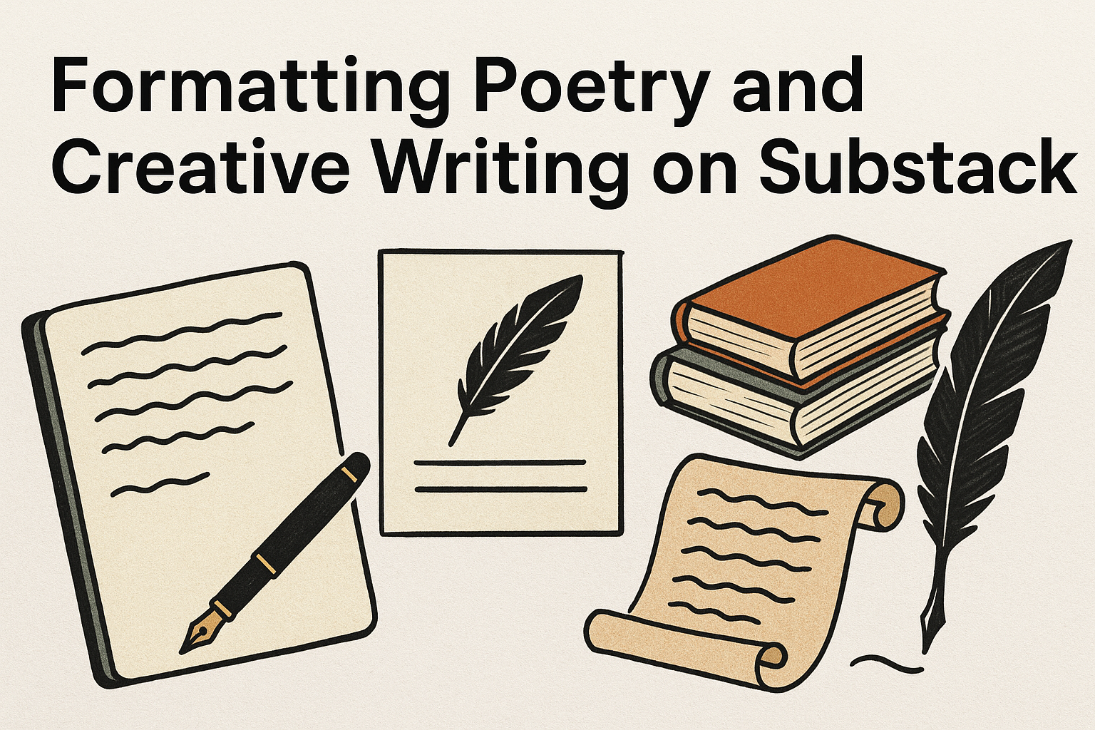
Delving into the world of poetry and creative writing on Substack offers writers a unique platform to showcase their art beautifully. Making your poetry and creative writing visually appealing on Substack is key to capturing and holding your readers’ attention. Formatting is not just about aesthetics; it enhances the reader’s experience and engagement.
Using tools and techniques for formatting can transform plain text into something captivating. Writers can benefit from understanding how to incorporate media, hyperlinking, and block quotes effectively. This enriches the storytelling experience and increases reader interaction with the content.
Substack provides various resources to help writers present their work in the best light. Exploring templates and styles can personalize and elevate your publication, making it memorable. For more tips and insights on formatting, check out the useful tips offered by Substack’s resources.
Understanding Substack’s Text Editor
Substack’s text editor is designed for ease of use and provides several formatting options to make posts engaging and visually appealing. It’s important to know both the capabilities of this editor and any limitations it might have.
Overview of Substack’s Formatting Capabilities
Substack’s text editor offers a variety of tools to enhance writing. Users can easily apply bold or italic styles to emphasize words. Creating lists is straightforward, which helps structure information clearly. Headers in different sizes help break up text and guide readers through the content.
In addition to text, writers can embed images and videos. This multimedia support helps make the writing more attractive and engaging. Substack also allows hyperlinks, making it easy to direct readers to additional resources or related content, like an overview of writing tips on Substack.
The editor is intuitive, meaning it doesn’t require technical skills to navigate. Writers can focus on creating content without getting distracted by complex formatting tools. This simplicity is one reason why it’s popular among both new writers and experienced ones looking for a straightforward platform.
Limitations and Workarounds
While Substack’s editor is powerful, it does have some limitations. For instance, certain advanced formatting features found in dedicated design software aren’t available. This might be a downside for authors seeking highly customized layouts.
There are workarounds to these limitations, though. If additional styling is required, authors can insert custom HTML or CSS in their posts. This involves a bit of coding but allows for more design flexibility. Another option is to create designs using external software and then embed them as images within the post.
Substack’s editor currently lacks built-in support for footnotes or interactive elements like polls. Creators who need these features may have to manually include them or link to external services. Despite these limitations, Substack remains a versatile platform for most creative writing needs.
Setting Up Your Poetry Workspace
A well-organized poetry workspace on Substack enriches the reading experience. Selecting the right template and customizing the visual layout are key steps to create an appealing presentation of your poems and creative writing.
Selecting the Right Template
Choosing the right template is crucial for displaying poetry on Substack. Substack offers various formats suitable for different writing styles. Some templates emphasize text, while others incorporate multimedia elements.
Templates focused on text are often preferred for poetry. They create a clean, distraction-free reading experience. Select a template that aligns with the flow and rhythm of your poetry.
For example, minimalist templates highlight the text and can emphasize each line break and stanza without interference. Users can explore formats to find the best fit for their artistic needs.
Customizing the Visual Layout
Customizing the visual layout involves adjusting fonts, colors, and spacing to match the tone and style of the poetry. Substack allows creators to alter these elements, offering flexibility to enhance their work’s appeal.
A serif font might be chosen for its classic look, while a sans-serif font provides a modern touch. Color choice is important too; subtle colors can convey mood and emotions effectively.
Creators should experiment with line spacing to let the words breathe, making sure each poem is visually impactful. Using these customization options gives poets the tools they need to create a consistent and inviting workspace for their audience. Check more on formatting and styling options to complement your work.
The Art of Spacing and Pacing
Effective use of spacing and pacing in creative writing can transform how poetry appears and feels to readers. Thoughtful decisions about where line breaks and spaces occur can change the rhythm and flow of a piece, giving it life and energy.
Line Breaks and Spacing Techniques
Line breaks serve many purposes in poetry. They can create emphasis, set a mood, or introduce pauses that invite reflection. By thoughtfully choosing where lines end, poets can influence how their work is perceived and understood.
Short lines can add urgency or tension, while longer lines might suggest calm or continuity. Spaces within poetry are equally crucial. They allow for visual breaks and can signal shifts in tone or speed. Consider using varied spacing to mirror the themes or emotions within the piece itself.
Experimenting with alignment—such as centering or justifying text differently—can add unique visual impact. Consistency is key to maintaining cohesion while allowing for creative freedom.
Pacing the Reader’s Experience
Pacing in poetry isn’t just about speed; it’s about guiding the reader through a journey. Varying sentence lengths can control the tempo of a poem. Short, quick lines create a fast-paced rhythm, while longer, complex sentences encourage lingering and contemplation.
Repetition and alliteration are tools that help set pace. Repeated sounds or phrases can slow the reader down or speed them up, shaping their experience. A well-paced poem will align the reader’s emotional journey with the intended message or feeling.
Using stanza breaks can also guide pacing, providing natural pauses that help transition from one idea to another. Through thoughtful pacing, poets can craft an immersive experience that resonates with the reader long after the final line.
Creative Typography In Your Writing
Creativity can shine through typography by adding emotional depth and clarity to poetry and creative writing. The right font choices and strategic use of italics, bold, and underline can enhance the reader’s experience.
Font Choices for Emotional Impact
The fonts selected for a piece of writing can greatly influence the reader’s emotions. Writers on platforms like Substack can choose fonts that match the mood of their work. For instance, serif fonts often convey tradition and seriousness, perfect for a classic poem or somber topic.
On the other hand, sans-serif fonts give a modern and clean feel, which might suit light-hearted writing or contemporary themes. Script fonts add elegance and can be used in emotional or romantic contexts. It’s important to ensure fonts are legible; readers should not struggle to read your words.
Mixing fonts within a piece should be done with care. Too many fonts can be distracting, while a well-chosen combination can highlight different sections or themes. Consistency in style is key, so stick with 2-3 fonts to maintain cohesion and clarity.
Using Italics, Bold, and Underline Effectively
Italics, bold, and underline are tools that can emphasize parts of your writing. Italics are often used for gentle emphasis or to indicate thoughts or dialogue in creative pieces. They give a subtle change in tone without being overpowering.
Bold text grabs attention and is ideal for highlighting key points or powerful statements. It’s best used sparingly to avoid overwhelming the reader. Underline, though less common, can be effective for linking ideas or emphasizing certain words without using bold.
Combine these effects strategically. For example, using italics and bold together might be too strong for some contexts but can be impactful in others. By using these features thoughtfully, the writer enhances the text’s emotional range and clarity.
Incorporating Visual Elements
In poetry and creative writing on Substack, adding visual elements can enhance the reader’s experience. By integrating images, illustrations, and even simple borders or lines, a writer can make their work more engaging and visually appealing.
Adding Images and Illustrations
Images and illustrations can bring poetry and creative writing to life. Including relevant visuals helps to establish mood and can provide context to a piece. On Substack, adding these elements is straightforward. Writers can easily upload images by clicking on the media icon in the editor.
When selecting images, it’s important to ensure that they complement the writing. High-quality images that relate to the theme or narrative can enhance the reader’s emotional response. Substack allows for various formatting choices, so writers can adjust image sizes and alignments to best fit the style of their work.
Using tools to edit or design custom illustrations can also add a personal touch. Programs like Canva or Adobe Spark can be used to create unique visuals. These help in matching the artwork closely with the tone and theme of the writing.
Using Borders and Horizontal Lines
Borders and horizontal lines are simple yet effective visual elements that can structure content. They help break up the text, making it more readable and organized. On Substack, horizontal lines can be added easily with basic commands in the editor.
Borders can frame a section, emphasizing important parts of the writing. Adjusting the width and style of these lines allows writers to highlight quotes or significant sections uniquely. This ability ensures that the lines add to the aesthetic without becoming distracting.
In choosing where to place lines, they can effectively separate different sections or denote shifts in tone or subject. This adds clarity and enhances the overall visual presentation without overshadowing the written content.
Enhancing Readability
To ensure that poetry and creative writing shine on platforms like Substack, writers need to focus on readability. Key elements include using colors that offer sufficient contrast and incorporating white space to make the content easy on the eyes.
Contrast and Color Considerations
Choosing the right colors can significantly impact a reader’s experience. High contrast between text and background ensures that words stand out clearly. For instance, using black text on a white background is a classic choice because it maximizes readability.
Avoid overly bright or clashing colors, as they can strain the eyes. Instead, opt for softer tones that complement each other. Testing different color combinations can help identify what works best.
Consider using color to emphasize important elements without overwhelming the reader. For example, bolding titles or key lines and using a subtle highlight can guide the reader’s attention without causing distraction.
The Role of White Space in Poetic Form
White space is a crucial element in poetry and creative writing. It provides a visual break for the reader, allowing the eyes to rest and the mind to absorb the content. Proper use of white space can enhance the flow of the poem and emphasize important lines or stanzas.
Spacing should be used to separate ideas or sections of a poem. This helps the reader transition smoothly from one thought to another. Let lines breathe by avoiding clutter and dense blocks of text.
A well-formatted poem with enough white space can transform the reading experience, turning it into something both visually engaging and emotionally impactful. Aim to balance words and spaces to keep readers focused and interested in the content.
Engaging Your Substack Audience
Creating an engaging environment for your Substack readers involves using interactive elements and encouraging responses. These strategies help build a connection between the writer and the audience, making the content more meaningful and engaging.
Interactive Poetry
Interactive poetry invites readers to be part of the creative process. Writers can create challenges or prompts where readers contribute lines or stanzas to a poem. This not only sparks creativity but also makes readers feel valued and part of a community.
Another way to actively involve the audience is by using multimedia elements. Incorporating audio recordings of the poems can enhance the reading experience, providing an auditory dimension to the text. Readers might also appreciate visual accompaniments like artwork or illustrations that complement the mood and theme of the poetry.
By adding small details and encouraging participation, writers can transform their Substack space into a lively and engaging poetry hub.
Encouraging Reader Responses
Encouraging responses is key to building a lively community. Writers can ask open-ended questions at the end of a post to prompt discussion and invite readers to share their thoughts or experiences related to the writing.
Hosting Q&A sessions or live discussions can also encourage interaction. Readers appreciate when writers take the time to respond to their comments, showing that their voices matter. This builds a sense of connection and belonging.
Polls and surveys can also engage readers, allowing them to share opinions on upcoming topics or content ideas. These interactive tools make readers feel invested in the publication’s direction, increasing engagement and loyalty.
Publishing Strategies
Publishing on Substack involves careful planning to reach and engage readers. Selecting the right time to post is crucial, while engaging pre-content promotions can build anticipation and boost interest among subscribers.
Scheduling For Maximum Impact
Choosing when to publish can make a big difference in how many people read and interact with content. Many writers find success by posting at the same time and day each week. This regularity creates a pattern that readers can count on.
Using data or insights about the target audience can help decide optimal times that gather the most attention. For instance, some writers notice higher engagement in the evening or on weekends, while others prefer weekday mornings. It’s beneficial to experiment with different schedules to find out what works best. Readers may appreciate consistency, keeping them returning week after week.
Teasers and Previews
Giving subscribers a sneak peek into upcoming content can stir interest and engagement. Teasers can include a catchy excerpt or intriguing image from the next post. This not only builds excitement but also encourages readers to look forward to new uploads.
Social media channels are helpful for sharing these previews. By creating a buzz outside the platform, writers can draw new readers to their Substack. Personal touches, like brief behind-the-scenes tidbits or interactive questions, involve readers more deeply, turning them from passive subscribers into active participants in the publishing journey. Creating a visually appealing layout adds extra charm to these preparations without needing complex setups.