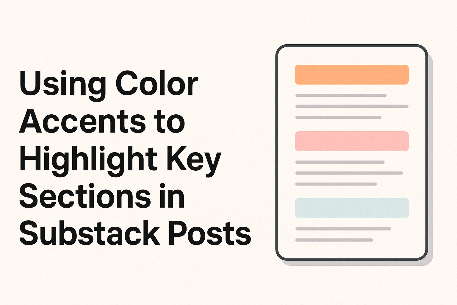
In today’s digital space, capturing your reader’s attention has never been more important. One effective method is using color accents to highlight key sections in Substack posts. This technique draws the eye to important areas, making content easier to read and more engaging.
Choosing the right color contrast can significantly affect a reader’s experience. By selecting colors that align with the brand and improve readability, writers can enhance the visual appeal of their posts. For example, using a dark text color on a light background or vice versa ensures text stands out clearly.
A consistent color palette throughout the content can create a cohesive look that strengthens a brand’s identity. Experimenting with accent colors, like changing the color of buttons or the background, can also make a reader’s journey more enjoyable. This approach not only improves aesthetics but reinforces the core message of the post.
The Importance of Color in Visual Storytelling
Color is a powerful tool in visual storytelling, playing a key role in evoking emotions and setting the tone. It guides the audience’s perception and helps highlight important elements within a story.
Psychology of Color
The psychology of color examines how different hues influence emotions and behavior. For instance, red often symbolizes passion or urgency and can create excitement. Meanwhile, blue might evoke feelings of calmness or trust, making it ideal for establishing a tranquil atmosphere. By selecting colors intentionally, storytellers can tap into these emotional cues to engage their audience deeply.
Different cultures may perceive colors differently. Thus, understanding the audience’s background is crucial in ensuring the intended message is communicated effectively. Awareness of how colors impact emotions helps storytellers create more resonant and memorable narratives.
Color Theory Basics
Color theory provides essential principles to effectively use colors in storytelling. The color wheel is the most basic tool, illustrating the relationships between primary, secondary, and tertiary colors. By using the wheel, creators can find complementary and analogous colors that work well together.
Harmony and contrast are vital concepts in color theory. Harmony ensures a pleasing visual experience, often achieved through analogous colors. Conversely, contrast, such as pairing complementary colors, can draw attention to specific parts of the story. Balancing these elements helps in guiding the viewer’s focus and enhances the storytelling experience. Understanding these basics aids storytellers in crafting visuals that not only appeal aesthetically but also reinforce the narrative.
Design Principles for Substack
Designing content for Substack involves maintaining a consistent style, balancing text with visuals, and ensuring accessibility for all readers. These elements make the publication aesthetically pleasing and easy to read.
Consistency Across Posts
Consistency helps readers recognize and connect with the publication. Maintaining uniformity in fonts, colors, and layouts across posts creates a cohesive look. This doesn’t mean every post should look the same, but using a standard template or design guideline helps.
A consistent brand identity helps readers feel familiar with the content. For instance, using the same header style and color scheme can make navigation easier. Regular elements, like bullet points or numbered lists, enhance readability.
Additionally, adjusting visuals to reflect evolving content themes can keep the design fresh while sticking to a cohesive visual language.
Balancing Text with Visuals
Visually engaging posts can keep readers interested and improve understanding. Balancing text with images or graphics breaks up long paragraphs and helps convey complex information more clearly. Substack users should choose visuals that enhance content rather than distract from it.
Infographics, charts, or graphs can be used to present data-driven content. Placing images strategically in a post can highlight key points, while captions add context. It’s essential to keep image file sizes small to reduce load times.
Using headings, subheadings, and highlight elements like bold or italic text can guide readers and emphasize important information.
Accessibility Considerations
Ensuring accessibility in design means making content readable for everyone, including people with disabilities. Using high-contrast colors between text and background enhances visibility. Readers benefit from text that is easy to read with clear fonts and sufficiently large sizes.
Alt text for images ensures that screen readers can interpret visual information. Additionally, avoiding color-based cues only prevents misunderstandings for color-blind users.
Line spacing, such as at least 1.5 times the font size, can make the text easier to read, especially for those with visual impairments. These steps improve the inclusivity of a Substack publication, reaching a broader audience.
Choosing Your Color Palette
When creating a Substack post, choosing the right color palette is key to catching readers’ attention. It involves aligning colors with your brand, exploring current trends, and using tools to find complimentary shades.
Brand Alignment
Colors are a big part of how people view a brand. Using colors from your brand’s existing scheme ensures consistency across all platforms. This can build trust and recognition among readers.
For example, if a brand primarily uses blue and white, incorporating these into Substack posts can make them instantly recognizable. Moreover, adjusting color saturation or brightness can offer subtle variations while maintaining alignment. This way, even slight changes can uphold a cohesive look. Color choices should always reflect the brand’s values and personality, giving readers a sense of familiarity.
Trend Research
Keeping up with current color trends can make content appear modern and appealing. Each year, new color trends emerge, often highlighted by design authorities or popular culture. For instance, pastel tones may be more in vogue one year, while bold shades might take the spotlight the next.
By staying informed, creators can incorporate these trends into their posts to feel fresh and relevant. Research can be done easily online by following industry blogs or design publications. It’s helpful to balance these trends with your brand’s unique style, creating a harmonious yet current look to engage readers effectively.
Color Matching Tools
Utilizing color matching tools can simplify the process of choosing the right palette. Tools like Adobe Color, Coolors, or Canva can help in selecting colors that complement each other. These tools often provide pre-made palettes or allow users to experiment with different combinations.
By entering a base color into these tools, users can generate a full palette that aligns with the principles of color harmony. For example, a base color might suggest several complementary shades. These tools help ensure a balanced, pleasing color scheme. Many of them also offer the 60/30/10 rule advice to combine primary, secondary, and accent colors, enhancing the visual appeal of Substack posts.
Implementing Color Accents
Using color accents in a Substack post can enhance readability and guide the reader’s focus. Effective use of colors helps draw attention to important elements like call-to-action buttons, quotes, and organized information.
Highlighting Calls to Action
Calls to action (CTAs) stand out when paired with vibrant colors. For example, using a bold color on ‘Subscribe’ or ‘Read More’ buttons encourages interaction. The bright hues make these buttons pop, making actions clear and inviting.
Consider using colors that contrast with your background. If your post has a light background, a bold blue or red button can be appealing. This draws the eye naturally without overwhelming the content.
Avoid too many colors to keep the design cohesive. Consistency ensures a clean, professional appearance, preventing distracting visual clutter.
Emphasizing Quotes and Statistics
Quotes and statistics gain impact through subtle color accents. Highlighting these sections in a distinct color can help them stand out from the main text. For instance, a soft gray background or italicizing important stats can add emphasis without overwhelming the narrative.
Colors like green or gold can denote credibility or importance. This method encourages readers to focus on key figures or expert opinions.
It’s essential to maintain readability by ensuring there’s enough contrast between text and background colors. This keeps the information accessible and legible.
Navigating Hierarchical Information
Color can be a helpful tool for organizing content into hierarchies. Using different shades or tints helps distinguish sections or categories within the post. For example, headings can be in a slightly darker shade, while subpoints might be lighter.
This method aids readers in following complex information. They can visually break down content into digestible parts, making navigation simpler.
A color-coded system can also highlight themes, helping readers recognize related topics. Remember to keep the palette simple and uniform, sticking to a few colors to avoid confusion.
Practical Tips and Tricks
Using color accents in Substack posts can enhance readability and emphasize key points. This section covers practical advice on integrating images, adjusting typography, ensuring color contrast, and incorporating interactive elements to make your posts more engaging.
Working with Images and Graphics
Images and graphics add visual interest and can break up text blocks. They should complement the content and not overwhelm it. When using color accents in images, ensure the colors align with the overall theme of your post.
This creates a cohesive look. Tools like Canva can help in designing custom graphics that match your color scheme. When choosing colors for graphics, consider their meanings and associations. For example, blue often conveys trust, while red can express urgency or importance.
Use white space effectively around images to highlight them. When embedding graphics, HTML or Markdown can help in maintaining a clean layout. Tagging images with descriptive alt text improves accessibility and is helpful for screen readers.
Typography and Color Contrast
Typography plays a vital role in readability. Choosing the right font style and size is crucial. When applying color accents to text, contrast is key. Strong contrast between text and background ensures that the content is easy to read.
For a light background, dark text is advisable, and vice versa. Tools like the Ultimate Guide to Substack Article Formatting offer practical tips on selecting color contrasts. Headings and subheadings can be color-coded to guide readers’ attention to important areas.
Different colors for quotes, highlighted text, and links can help in distinguishing sections. Ensure that hyperlinks stand out by using underlining or bold fonts.
Interactive Elements
Interactive elements can engage readers and underline certain sections effectively. Quizzes, polls, or clickable infographics can be used with color accents to make them stand out. The right use of colors in these elements highlights their importance and can encourage participation.
For instance, call-to-action buttons should be a contrasting color to grab attention. Experiment with using animations or hover effects on these elements to make them more dynamic.
It’s also important to ensure these interactive features are accessible on all devices. Responsiveness is key, and testing on different screen sizes can help ensure a consistent user experience. Maintaining accessibility standards ensures that all readers, including those with disabilities, can interact with the content easily.
Analyzing the Impact
Using color accents in Substack posts can enhance the reader’s focus and comprehension. This section explores how color accents affect reader engagement, the methods for collecting feedback, and the importance of revisiting color choices.
Reader Engagement Metrics
Color accents can significantly influence reader engagement. One way to assess this is by analyzing metrics such as time spent on a page, scroll depth, and click-through rates. These metrics can show if readers are more captivated by posts that use strategic color accents.
A/B testing can be effective here. By comparing posts with different color schemes, data can be gathered on reader preferences. Substack’s dashboard provides tools to help track these metrics easily. If a certain style of color accents leads to more interactions, it may be beneficial to use that approach consistently.
Feedback Collection
Gathering feedback from readers is crucial in determining the impact of color accents. Simple polls or surveys at the end of an article can provide insights into how colors affect readability and enjoyment. Asking direct questions about color choices encourages readers to share specific opinions.
Additionally, open-ended feedback allows readers to explain their preferences in detail. Engaging with readers through comments can also be valuable. These insights can help guide future design choices, ensuring that the color scheme remains effective and appealing.
Color Adjustments Over Time
Regularly revising color accents can help maintain reader interest. Trends in design and changing reader expectations might make certain colors more or less effective. Experimentation with different hues or contrast levels can keep content fresh and engaging.
Consulting analytics reports helps in identifying when a change is needed. If engagement metrics drop, tweaking color settings might help. Additionally, user feedback gathered over time can guide these adjustments. Adjusting colors based on both data and reader input ensures continued success.