Creating engaging geographical content on Substack can be a rewarding way to connect with readers. Interactive maps make complex data more accessible and visually captivating. Using tools like Datawrapper, writers can easily embed interactive maps in Substack posts to enhance storytelling and audience engagement.
Substack provides a user-friendly platform for writers to share their geographical content while monetizing their work. Adding interactive maps can capture the audience’s attention and provide a more dynamic reading experience. This kind of content allows users to interact with visual data in meaningful ways.
For those new to creating maps, step-by-step guides are available to ease the process. Whether for educational purposes or storytelling, geographic visuals become more than just data points. They offer unique insights that can transform a typical reader into an engaged explorer.
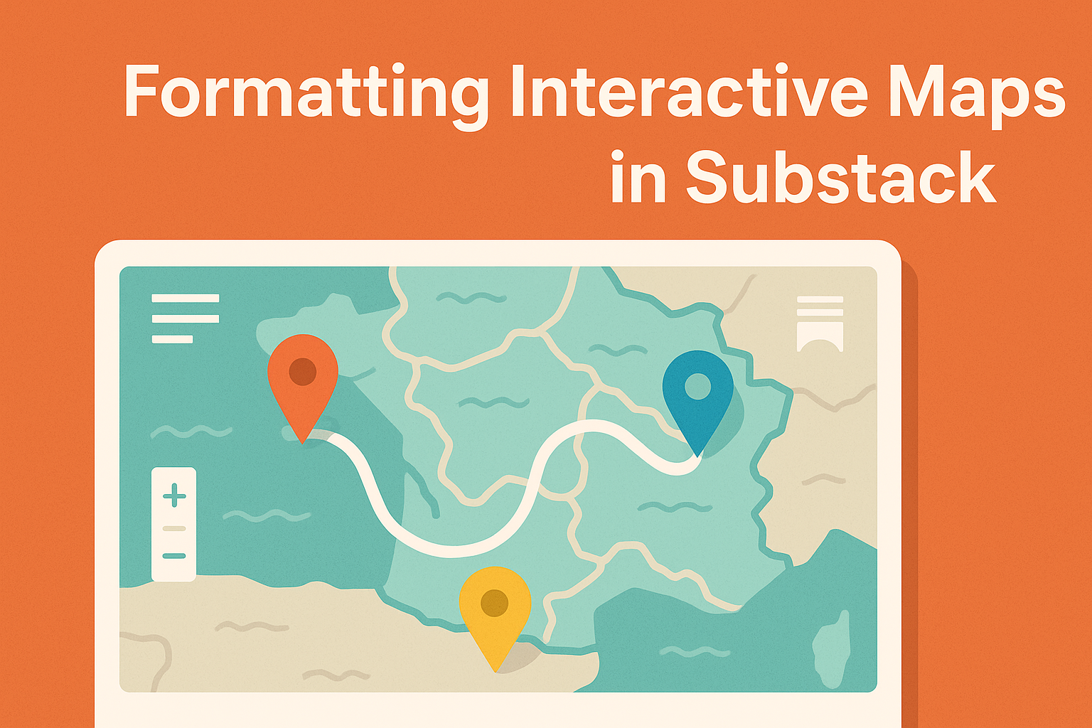
Understanding Interactive Maps
Interactive maps bring a new way of exploring geographical information. They enhance storytelling and engage audiences by integrating multimedia elements and allowing users to interact with data in dynamic ways.
The Importance of Interactive Elements in Storytelling
Interactive maps are key in creating engaging stories. They help audiences connect with the content by providing an immersive experience. Features like clickable icons, pop-up images, and videos can make geographical data more relatable. These elements let users explore at their own pace. This engagement keeps readers interested and helps them understand complex data. Maps that change with user input adapt to individual interests, making them vital for impactful storytelling.
Types of Interactive Maps
There are several types of interactive maps, each serving a different purpose. Heatmaps show data density, ideal for visualizing population or traffic patterns. Choropleth maps use colors to represent data ranges, useful in displaying statistics like income levels across regions. Animated maps highlight changes over time, perfect for showing trends like migration or climate shifts. Point maps display precise locations, often used in tourism or logistics. It’s crucial to choose the right map type to effectively communicate the intended message.
Getting Started with Substack
Substack offers a user-friendly platform to create engaging content with interactive elements. It is particularly useful for writers looking to integrate maps or geographical data into their newsletters. The ease of access and powerful features make it an appealing choice.
Why Choose Substack for Your Interactive Maps
Substack is an excellent choice for publishing content with interactive maps. It allows writers to easily incorporate maps, enhancing the reader’s understanding of geographical information. The platform supports various content formats, making it versatile for creators. Writers can embed Datawrapper charts and maps without complex coding skills.
Using Substack can help writers reach a broader audience. The platform offers features to easily share and distribute content, enabling users to build a community. Integrated analytics provide insights into reader engagement, helping writers refine their content strategies. This makes Substack not only a publishing tool but also a growth platform for content creators.
Setting Up Your Substack Newsletter
Setting up a Substack newsletter is straightforward, even for beginners. To get started, create an account on the Substack website. Once registered, writers can select “+New post” from their dashboard to start publishing. The platform’s interface is intuitive, focusing on ease of use.
Writers can customize the appearance of their newsletters to match their brand or style. This includes choosing fonts, colors, and layout designs. Substack also offers options to categorize content, helping readers find what interests them the most. For those wishing to monetize, Substack provides simple options to integrate paid subscriptions, allowing writers to generate income from their work.
Integrating Maps into Your Substack Posts
Integrating maps into Substack posts can greatly enhance geographical content by making it interactive and visually appealing. This section focuses on different embedding options and customization tips to help you maximize the impact of maps on your audience.
Options for Embedding Maps
When embedding maps in Substack, creators have several choices. Google Maps, Datawrapper, and Mapbox are popular tools that allow users to insert maps directly into their posts.
With Google Maps, open a map, select “Share” and then “Embed a map”. Copy and paste the HTML code into your Substack editor. Datawrapper charts can also be embedded in a similar way by copying the shareable link.
Using Mapbox provides more customization, although some coding might be required. This flexibility can lead to stunning, interactive maps. Regardless of the tool, ensure your map links relate to the content effectively and are easy for readers to use.
Customization Tips
When customizing maps, focus on style and functionality. Adjust colors and markers to align with your post’s theme, ensuring the map is both informative and visually consistent with other elements.
Label placement is critical. Make sure they’re clear and not obstructing important content. Adjust the zoom level to highlight relevant areas and simplify user navigation.
Consider using interactive elements like pins or pop-ups to provide additional data points or context, encouraging deeper engagement. Balancing detail with clarity is essential to maintain reader interest and understanding.
By employing these customization strategies, you can transform a basic map into a powerful tool that captivates your audience and enriches your Substack posts.
Designing Engaging Maps
Creating engaging maps involves combining essential design principles with the right tools and software. This approach ensures that geographical content is both visually appealing and informative, grabbing the audience’s attention.
Essential Design Principles
The first step in designing attractive maps is understanding the importance of clarity. Maps should present information clearly, without clutter. This can be achieved by choosing a simple color scheme and using readable fonts.
Labels should be easy to read and not obscure important features. Another key consideration is interactivity. Features like zooming or clickable points can enhance user engagement. Interactive elements should be easy to use and not overcomplicate the map.
Consistency is crucial. Maintain uniformity in font styles, colors, and icon types throughout the map. This helps in creating a professional and cohesive look.
Tools and Software for Map Creation
To create professional-looking maps, several tools and software options are available. Tools like Pandasuite allow users to customize map design by selecting data and manually integrating elements. This flexibility is great for tailoring the map to specific needs.
For a more comprehensive approach, using platforms like Mapstack can help incorporate interactive features. These platforms often include drag-and-drop functionalities for ease of use.
Design software often enables users to upload and manage icons and images, ensuring that maps are not only functional but also visually appealing. Choose a tool that fits your technical skill level and desired outcomes to create maps that truly engage users.
Enhancing User Interaction
Improving user interaction with interactive maps in Substack is crucial for keeping readers engaged. Highlighting key features and ensuring ease of use can make geographical content more accessible and enjoyable.
Interactive Features to Include
Integrating 360-degree views allows users to see geographical areas from different angles, enhancing their understanding. Animations can illustrate changes over time, such as population growth or climate data. These dynamic elements keep users engaged and encourage exploration.
To add depth and context, incorporating interactive maps with detailed pop-ups or tooltips is beneficial. These features provide additional information when users hover over or click on specific areas. It makes exploring the map a richer experience.
Adding a search function enables users to find specific locations or data points easily. This feature is particularly useful for large or detailed maps, helping users navigate without frustration.
Creating a User-Friendly Interface
A clean and intuitive design is key to making interactive maps user-friendly. Users should be able to navigate the map without feeling overwhelmed by excess information or complex controls. Focus on clear labels and guides.
Utilize zoom and pan features to let users explore maps in detail or view larger areas. These controls should be smooth and responsive, making the navigation experience seamless.
Consistent design elements across different maps ensure users don’t have to relearn controls each time. Additionally, responsive design ensures maps display well across devices, from desktops to mobile phones. This accessibility broadens the potential audience for the content.
Content Strategy for Geographic Information
Interactive maps are a powerful way to present geographic data in a compelling manner. Key strategies include creating engaging narratives using maps and effectively balancing text with visual elements to enhance readability and user engagement.
Crafting Narrative With Maps
Maps can tell a story that draws the reader in. By combining location data with storytelling, writers can transform abstract information into a relatable experience. This approach helps put geographical facts into context, making them more engaging.
Details like historical events or cultural insights can be layered over the map to enrich the content. Highlighted paths or specific markers can guide readers through a narrative journey. Visual cues can serve as storytelling devices, helping convey the intended message effectively. Interactive elements like clickable regions can further engage users by revealing more information or prompting actions like signing up for newsletters.
Balancing Text and Visuals
Balancing the map’s visual impact with text is essential for maintaining reader interest. Too much text can overwhelm; too little might leave readers confused. A clear division of space ensures that readers can easily process information.
Short paragraphs next to maps help maintain focus on both text and visuals. Captions or brief annotations can explain the map’s features without cluttering the page. Strategically placed text boxes can draw attention to specific areas, while side panels can provide details without distracting from the map itself. By considering design elements and readability, creators can achieve a harmonious blend that captivates audiences.
Mobile Responsiveness
Ensuring that maps are mobile-friendly is crucial for enhancing the user experience. This involves optimizing map displays to suit smaller screens and touch navigation commonly used on mobile devices.
Adjusting Maps for Mobile Users
When designing maps for mobile devices, some key adjustments need to be considered. Zoom levels must be optimized for smaller screens to ensure details are clear. It’s important to set initial zoom levels that make major map elements visible without overwhelming the user.
Touch controls should be smooth and intuitive. Users should be able to pinch to zoom and swipe to pan with ease. Responsive design is vital, making sure that maps resize and adapt to different screen sizes.
Performance is another important factor. Maps should load quickly and efficiently, even on slower connections. Keeping map data light by reducing unnecessary layers can greatly improve loading times. By focusing on these aspects, users can have a seamless experience accessing geographical content on their mobile devices.
Promoting Your Interactive Maps
Sharing and promoting interactive maps involves using social media platforms and optimizing them for search engines. This approach ensures greater visibility and engagement.
Marketing Through Social Media
Social media is a fantastic platform to showcase interactive maps. Sharing maps on platforms like Instagram, Facebook, and Twitter can amplify reach. Visual content, like interactive maps, attracts more attention and engagement.
To make content stand out, using eye-catching images or videos of the map’s features is key. Encouraging users to share their experiences or thoughts about the map can further increase reach. Utilizing hashtags related to the map’s topic can connect the content with relevant audiences.
Collaboration with influencers can also boost visibility. Influencers can introduce interactive maps to new audiences, creating a buzz and encouraging more interactions. Hosting live sessions where audience members can explore the maps together also provides a real-time engaging experience.
Leveraging SEO with Interactive Content
Interactive maps can improve search engine rankings when optimized properly. They need descriptive titles and alt text for search visibility. Including relevant keywords in the map’s descriptions helps in ranking for target searches.
Creating content around the map, such as blogs or articles, enhances SEO efforts. Each piece of content should link back to the map, increasing its authority and relevance on search engines.
Maps should load quickly, as search engines favor faster sites. Using tools like Mapbox ensures efficient map creation and speed. Keeping a focus on user experience by making maps mobile-friendly further enhances SEO performance. Engaging content that is optimized for both performance and discovery will ensure the maps reach a wider audience.
Analytics and Feedback
When creating interactive maps on Substack, understanding how your audience engages with the content and collecting their feedback are crucial. These insights help improve content quality and user experience.
Measuring Engagement
Tracking how users interact with your maps can provide valuable insights. Substack offers detailed metrics, including total views, open rates, and conversion rates. Using these metrics, creators can assess which posts are attracting more attention. They can also identify which areas of the map receive more clicks or interactions.
Substack’s guide to metrics provides detailed instructions on interpreting these figures. By analyzing data such as geographic location and subscriber growth, creators gain a comprehensive view of audience interests and preferences.
Gathering User Feedback
User feedback is essential to refine and improve content. Creators can encourage readers to leave comments or participate in surveys. These direct responses help identify areas for improvement, such as map design or information clarity.
Engaging with readers through comments fosters community and encourages more interaction. Users are more likely to provide constructive feedback if they feel heard. Additionally, questions or polls in newsletters can engage readers and provide insights. This helps create content that resonates more deeply with the audience.
Legal and Ethical Considerations
Creating interactive maps on Substack involves important legal and ethical considerations. These include issues like copyright for map data and protecting individual privacy when using geolocation.
Copyright and Licensing of Map Data
When using map data, it’s crucial to respect copyright laws. Map creators need to ensure they have the right licenses for the data they use. Many maps are created from datasets that are protected by copyright. Tools like GIS can help transform this data, but proper licensing is required to legally use and share these maps.
Creators should investigate which licenses allow for their intended use. Open-source datasets often come with licenses that permit modification and sharing, but commercial datasets usually have stricter rules. Using data without permission can lead to legal consequences.
Privacy Issues with Geolocation Information
Privacy concerns arise when maps use information that reveals personal locations. Geolocation data can pinpoint a person’s whereabouts, potentially compromising privacy. Content creators should be cautious about sharing data that could identify individuals, especially if the map tracks their movements or personal spaces.
There are laws and guidelines that govern how this information can be used. For instance, certain jurisdictions require explicit consent from individuals before their location data is collected or shared. Creators should anonymize data where possible and ensure they comply with privacy laws to protect individuals’ rights.