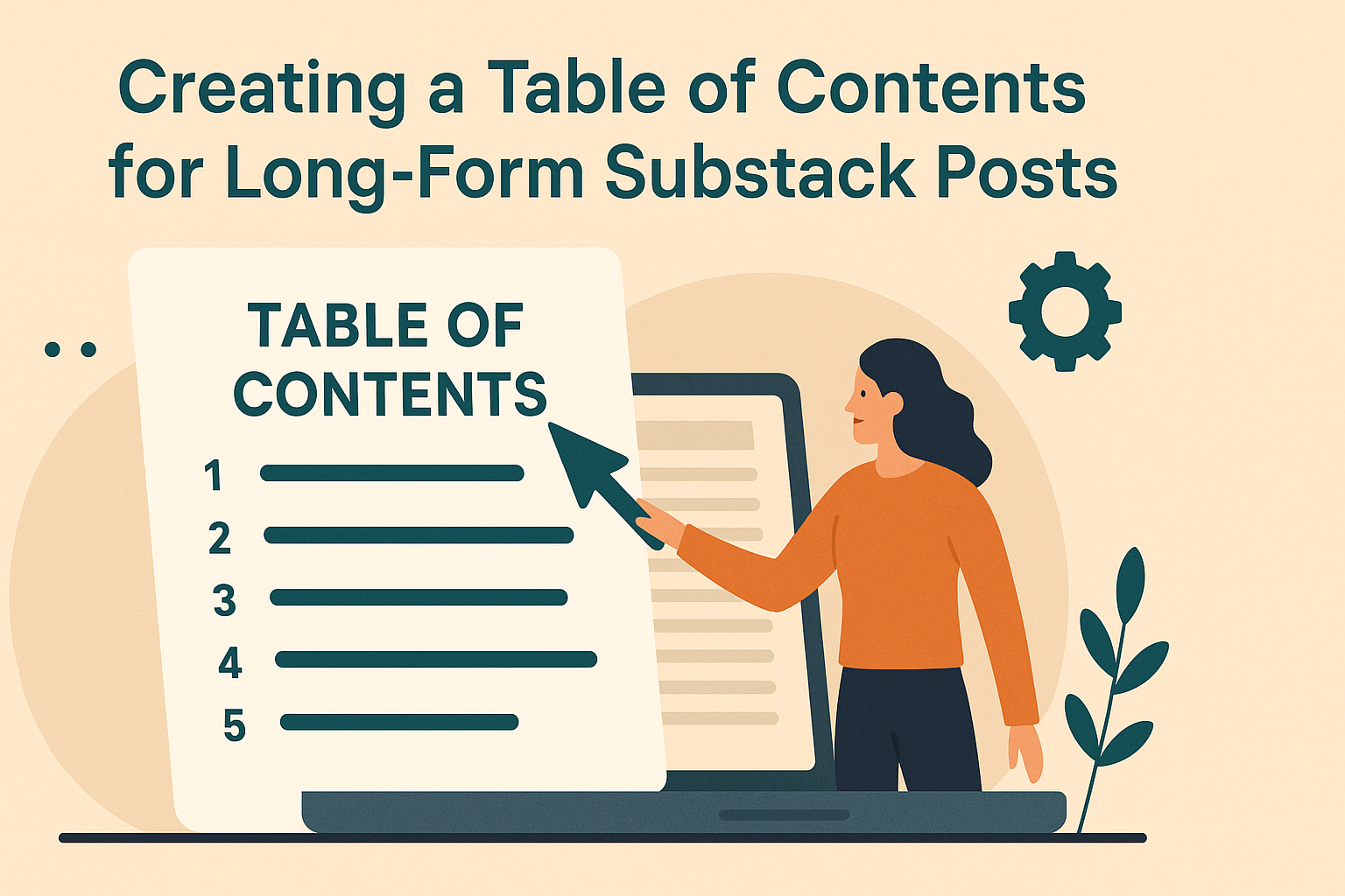
Long-form writing on Substack can be a joy, but navigating these lengthy posts can sometimes overwhelm readers. A Table of Contents (TOC) is a fantastic way to break down these posts, directing readers to specific sections with ease. This feature not only makes it simpler to follow complex topics but also enhances the overall experience for the audience.
Authors can benefit from using third-party tools like the Table of Contents Generator, which automates this process, making content accessible and enjoyable. Regular updates to the TOC ensure readers can easily explore every part of a series or collection. This kind of thoughtful structure not only keeps readers engaged but also encourages them to return for future updates.
Understanding Substack’s Structure
Substack is a unique platform that allows writers to create and share content with ease. It has a simple yet powerful structure that includes three main features: Newsletters, Posts, and Publications. Each element plays a role in how content is delivered and consumed.
Newsletters are a key component. They help writers connect with subscribers. A newsletter allows for consistent updates, keeping readers engaged. They can be scheduled to automatically send out new posts to subscribers.
Posts are the main form of content. Writers can craft engaging articles and stories. Posts can include images, links, and other media to enhance the reading experience. Formatting tools are available to make the content visually appealing.
Publications offer a broader scope. They act as a collection of posts and newsletters. Writers can categorize their work, making it easier for readers to find topics that interest them. Publications provide a way to organize long-form content effectively.
Substack’s structure supports monetization too. Creators can offer paid subscriptions, giving readers access to exclusive content. This allows writers to earn directly from their audience. The blend of free and paid content can help in growing a loyal readership.
In essence, Substack provides a versatile platform. Its structure is designed to support both casual bloggers and professional writers. With simple tools and an intuitive layout, writers can focus on crafting meaningful content.
Planning Your Content
Creating a plan is an essential step for anyone writing on Substack. It helps organize ideas and ensures a consistent posting schedule. This way, writers can keep their audience engaged and attract new readers.
A content calendar is a great tool for organizing. It lets writers plan topics, set deadlines, and schedule posts in advance. This structure can reduce stress and improve productivity.
Writers should start by brainstorming ideas. They can gather inspiration from various sources, like audience feedback or trending topics. It’s helpful to keep a list of ideas for future reference.
Prioritizing topics is also important. Some subjects might be more timely or engaging than others. By focusing on these first, writers can increase their likelihood of connecting with readers.
Maintaining flexibility in the content plan allows for adjustments. Sometimes, new opportunities or ideas arise, and being open to change can enhance creativity.
Designing a Table of Contents
When designing a table of contents, it’s key to keep things simple and clear. A well-structured table of contents helps readers find what they need quickly. Choosing the right layout can make all the difference in guiding your audience.
Use a Grid Layout: Consistent spacing helps readability. These layouts, like the one used by Dale Magazine, keep sections tidy and organized.
Choose the Right Fonts: Fonts should be easy to read. Use different sizes and weights for headings and subheadings to make it clear what is important. Proper font choice prevents eye strain and improves clarity.
Add Links: In digital formats, hyperlinks in your table of contents are helpful. Adding a Table of Contents in Substack involves linking section names to anchor points in your document.
Incorporate Color Accents: Color can highlight and differentiate sections, making it easier to navigate. Jeopardy Magazine’s design uses color accents to achieve a sophisticated look.
Emphasize White Space: White space around text elements makes content more scannable. Avoid crammed text, as it can overwhelm the reader.
Use strategies like these to create an effective and visually appealing table of contents for any long-form Substack post.
Formatting Your Table of Contents
Formatting your Table of Contents can make your Substack posts easier to navigate. Consider selecting an appealing style, adding helpful hyperlinks, and ensuring numbering updates automatically.
Choosing Your Formatting Style
Choosing the right style for your Table of Contents is key to keeping your long-form posts organized and visually pleasing. Different styles offer various layouts and font options, so it’s essential to select one that aligns with your writing’s tone and design. Bold and italic styles can emphasize important sections, while tables or bullet lists can organize topics clearly.
Consider keeping the format simple to avoid overwhelming readers. Using different heading levels (H1, H2, etc.) helps in structuring your content hierarchically. This not only makes it visually appealing but also intuitive for readers following the post’s flow.
Incorporating Hyperlinks
Adding hyperlinks to your Table of Contents can significantly enhance user experience. By linking each entry in the Table of Contents to the corresponding section, readers can easily jump to the information they are interested in. This is particularly useful in long-form posts where readers might be looking for specific topics.
Inserting hyperlinks is a fairly simple process but requires attention to detail to ensure accuracy. Each link should point to the correct section to prevent confusion. Also, consider using descriptive anchor text for hyperlinks, as this helps with readability and SEO.
Updating Numbering Automatically
Updating page numbering manually can be tedious and often leads to errors. Using software features that automatically update numbering will save time and improve accuracy. This ensures that any additions or deletions in the content do not result in outdated numbering and frustration for readers.
In some writing platforms, this feature might come built-in, while in others, you may need to use specific tools or plugins. It’s worth exploring options within your platform or utilizing add-ons that automate this process. With automatic updates, consistency is maintained throughout the document, enhancing the professional look of your content.
Writing Effective Headlines
Writing effective headlines helps capture readers’ interest and sets the tone for the content. Using carefully crafted headlines and subheadings not only grabs attention but also guides readers through the article.
Crafting H2 Headlines
Crafting an H2 headline is an art that involves clarity, appeal, and relevance. A headline should be attention-grabbing and make the reader curious. It’s important to include keywords that reflect the main points of the article, ensuring that it is both informative and intriguing.
A good headline gives an insight into the article without revealing everything. Using strong action verbs can increase engagement by promising value or action, such as “discover” or “explore”. Also, keeping the headline concise and specific helps prevent misunderstandings and keeps the reader focused on what to expect.
Creating Engaging H3 Subheadings
Subheadings should guide the reader through the content and make it easy to follow. Each H3 subheading must provide a clear idea of the information in its section. By breaking content into smaller parts, they maintain interest and make the article more approachable.
Subheadings should complement the main headline and add depth to the topic. Using questions or statements that spark curiosity can enhance engagement. It’s a good practice to ensure these subheadings are keyword-rich to boost search engine visibility, helping more people find the content. By being descriptive and relevant, subheadings ensure the reader stays interested from start to finish.
Implementing Navigation Elements
Creating navigation elements in long-form Substack posts can make content more accessible for readers. A table of contents (TOC) is a great way to achieve this. By using links, readers can jump directly to the section they’re interested in. This feature enhances the user experience by making it easier to find information.
One approach is to manually add anchor links to headers. Writers can highlight the text and use the link button to attach the desired URL. This can be done by pointing to the section within the same document. This method offers a straightforward way to create linkable headers and organize the content efficiently.
For those looking for automation, tools like the Table of Contents Generator can be useful. This tool automatically generates a TOC for articles, saving time and effort. It’s perfect for writers who frequently publish detailed posts and wish to streamline the creation process.
Aside from TOCs, adding a “Start Here” page or an index can also direct readers easily. By having a list of all posts or key topics, readers can navigate through content quickly. Interactive navigation elements not only engage readers but also help in retaining their attention.
Maintaining a Consistent Layout
Consistency is key in making a long-form Substack post easy to read. A consistent layout helps readers follow the content smoothly.
Headings and Subheadings: Using headings like H1, H2, and H3 creates a clear hierarchy in the text. They act as road signs, guiding readers through the different topics covered.
Bulleted and Numbered Lists: Lists break information into bite-sized pieces. They make details easier to digest, especially when covering complex ideas.
Font Style: Stick to one or two fonts throughout the post. Using too many fonts can make the content look confusing. Bold or italicized text can highlight important points without being overwhelming.
Whitespace: Adequate whitespace prevents the page from looking cluttered. It gives the reader’s eyes a break, improving focus.
Visuals: Use images and graphics to complement text and support key ideas. They can illustrate points more clearly than words alone.
Alignment: Left-align text for an easy and natural reading flow. This is the typical way of reading English text and feels most comfortable to readers.
Keeping these elements consistent not only enhances readability but also shows professionalism. Readers are more likely to return to well-structured posts.
Enhancing Accessibility
Creating a table of contents on Substack can greatly help improve accessibility. Users with disabilities can benefit from a structured and easy-to-navigate document. Why focus on accessibility? It ensures everyone, including those using assistive technologies, can access your content smoothly.
Use clear headings for each section in your table of contents. This allows screen readers to identify and announce sections properly, helping users navigate without confusion. Each heading should be descriptive without being too lengthy.
Make each heading in the table of contents a clickable link. This gives users the ability to jump to specific sections right away. Learn more about how to do this in Substack by checking out this guide on adding a Table of Contents.
Include alternative text for any images or non-text elements. This text should describe the content, allowing screen readers to convey the information to visually impaired users.
Consider adding a list of key shortcuts, if available, to further assist users in navigating your content efficiently.
Following guidelines for creating accessible documents can further enhance the experience for everyone. Explore resources such as Northeastern University’s guide on creating accessible documents for more tips.
Keep in mind that small changes, like improving contrast or font size, can also make a big difference in accessibility. Simple adjustments can create a more inclusive and welcoming environment for all readers.
Utilizing Visual Elements
Visual elements can significantly enhance the readability of long-form Substack posts. They help guide readers and make the text engaging. Icons and color coding are two effective ways to use visual elements in posts.
Incorporating Icons
Icons are small visual symbols that represent different sections or concepts in an article. They can break up text-heavy sections and provide visual cues for readers. Using icons helps readers quickly identify key points or transitions between topics.
When incorporating icons, it’s important to choose designs that match the content and tone of the article. For example, a light bulb icon could highlight a bright idea, while a clock icon might indicate time-saving tips.
Substack allows easy integration of icons through its editing tools. Writers can upload custom images or use third-party icon libraries. Consistent icon usage across posts contributes to a recognizable and professional style. Using icons effectively can make long articles feel more interactive and less overwhelming for the audience.
Using Color Coding
Color coding is a method for organizing content by assigning different colors to specific sections or themes. This approach can help readers focus on distinct parts of the article, making navigation easier.
To use color coding effectively, select a palette that complements the overall design and is consistent with the publication’s branding. Consistency reinforces the brand identity and makes the blog look neat and organized.
Using bold or italic text in conjunction with color can further emphasize important points. Avoid using too many colors, as this might confuse readers. Instead, stick to a limited palette to create a clean, focused presentation. Color can enhance structure and aesthetic appeal, helping readers better engage with the content.
Ensuring Mobile Responsiveness
When creating long-form content on Substack, it’s important to make sure the Table of Contents looks great on all devices, especially mobile. Mobile responsiveness ensures readers can easily navigate your content.
Tips for Mobile Optimization:
- Use a simple layout that’s easy to scroll.
- Avoid large images that can slow down load times.
- Keep fonts readable at smaller sizes.
Font Choice Matters
He chose fonts that are clear and legible. Sans-serif fonts, like Arial or Helvetica, work well on smaller screens, reducing strain on readers’ eyes.
Test on Different Devices
Always test the Table of Contents on various devices. This helps catch any layout issues before publishing.
Keep Links Accessible
Ensure links in the Table of Contents are tappable. Shorten long section titles to fit within the screen without wrapping. This makes it easier for readers to select linked sections without zooming in.
Button Sizes
Use large, clickable buttons for links instead of plain text. This makes navigation simpler, especially for those with larger fingers.
Consistent Spacing
Consistent spacing is key. He maintained equal spacing between lines and sections to prevent a cluttered appearance. This enhances readability and aesthetic appeal.
Avoid Pop-Ups
Limit distracting elements like pop-ups. They can obscure content and frustrate users. Keeping the focus on clean, accessible navigation helps retain readers’ attention and engagement.
Previewing and Testing
Before publishing, it’s important to preview and test the Table of Contents in Substack. This ensures everything looks polished and functions correctly.
Begin by clicking the Preview button in the Substack editor. This allows the writer to see how the content, including the Table of Contents, will appear to readers.
Check each link in the Table of Contents. Make sure all links direct to the correct parts of the document. If any link is broken, fix it in the editor by updating the anchor tags.
It’s beneficial to view the post on different devices. By doing this, a writer can make sure the Table of Contents displays well on both mobile and desktop. This is key for accessibility.
Ask someone else to review the post. A fresh set of eyes might catch errors missed by the initial writer.
A final step involves checking how the Table of Contents affects navigation. Is it easy for readers to find what they need? If not, adjustments may be necessary.
Publishing Your Post
After creating a Table of Contents, it’s time to publish.
Make sure your post is in the draft phase and ready for review. This allows for easy edits before it goes live.
To publish, navigate to the Published section of your Substack dashboard. Your draft should be visible there once saved.
For a seamless experience, add engaging images and format your text clearly. Pictures can help break up text, making it more readable.
Before clicking the publish button, ensure all hyperlinks and anchor links are correct and functioning. This ensures that readers can navigate easily.
Consider scheduling your post. You can choose a specific day and time for it to go live. This is helpful if you want consistent content delivery.
When everything is set, press the Publish button. Your article is now available to your audience.
After publishing, promote your post on social media. Let your subscribers know it’s ready to read.
Engage with comments and feedback from readers once your post is live. This interaction builds community and encourages more followers.
If needed, you can always edit even after publication. Just ensure to update your readers about any significant changes.